Google Maps
Integrating events to maps to help users explore their world together
OVERVIEW
The Problem
Maps is one of Google's most celebrated products and a market leader in digital mapping with over 1 billion users. Despite its popularity, Maps has a lower daily active usage among Google apps with 1B+ users (i.e. Gmail). In order to secure its position in the market as well as increase engagement from users, Maps has repositioned their brand in 2018 from the classically navigation-oriented map to a product that helps users explore their world.
Maps' newer features around exploration are still not commonly known to users, many whom continue to traditionally use Maps to navigate to unfamiliar places.
The Solution
Maps can delight users while increasing their engagement on the app by considering how users explore their world - and why they do so - usually to connect with friends, family, and communities. With this in mind, I explored the idea of a more 'social' map by integrating events and the people users will meet in their exploration of their worlds.
Category
Add feature to existing app
Role
UX Designer
Timeline
June - July 2020 (80 hours)
Tools
Sketch, InVision
password: sarara
empathize
define
ideate
prototype
test
01 RESEARCH
02 DEFINE
03 IDEATE
04 PROTOTYPE
05 TEST
RESEARCH
Market Research
With knowledge of Google Maps solely as a consumer, I wanted to learn more about the digital mapping industry to understand the direction of the market and to identify potential opportunities and gaps. I also hoped to gain more familiarity with how users perceive maps and subsequently understand their needs and expectations from a digital map like Google Maps.
Relevant findings:
- Globally, the digital map industry market size is estimated at USD 6.19 billion in 2019.
- The digital mapping industry is growing rapidly due to new technology in map making and smartphone user growth.
- Ideas of maps has shifted from ancient times which 'captured' a state of knowledge at time of creation to interactive information refineries that show how to find food, entertainment, etc.
- Today’s maps are more linear - users are going somewhere and the map shows them their route as they go - users no longer need to figure out where they are, by default they are the center of their world.
- Google Maps targets urban millennials - millennials need to research and feel confident that brands and businesses align with their values; often, millennials prefer small businesses over large businesses so they can support a local economy while receiving unique goods and services.
View full report here.
User Interviews
Studying the market gave me insights into the broader direction of the industry towards exploration, one that Google Maps has shifted to already. When it came to understanding the ways users think about exploring their world and how they do it, I wanted to hear firsthand accounts of their behaviors so I recruited four participants for a remote facilitated interview. The interview was centered on what their interests were and how it influences they way they explore their world, and also the way they interact with digital map products like Google Maps.
Maps was used in a variety of ways in the lives of the users I interviewed adding color to what it means to individuals when they 'explore their world'. Users cited exploration interests such as buildings & architecture, photoshoot locations, the best restaurants, the best drinks, and even checking on how the roads in their home country have evolved. This was helpful context to keep me open about the possibilities that exploration can hold for different users.
When speaking to users about their Google Maps usage and behavior, I focused on what their lives looked like day-by-day and when + how Google Maps is used in their routines. Users mainly had 9-5 jobs, where they either drove or commuted to work so they would check traffic or transit information on the app. They typically saw their friends or family on the weekends when they had more free time, checking when places are open, if they have takeaway options (due to pandemic), public restrooms, and more. Once again, it was interesting to think about how integrated Maps are into every aspect of user's lives and reinforced that I should keep my perspectives open.
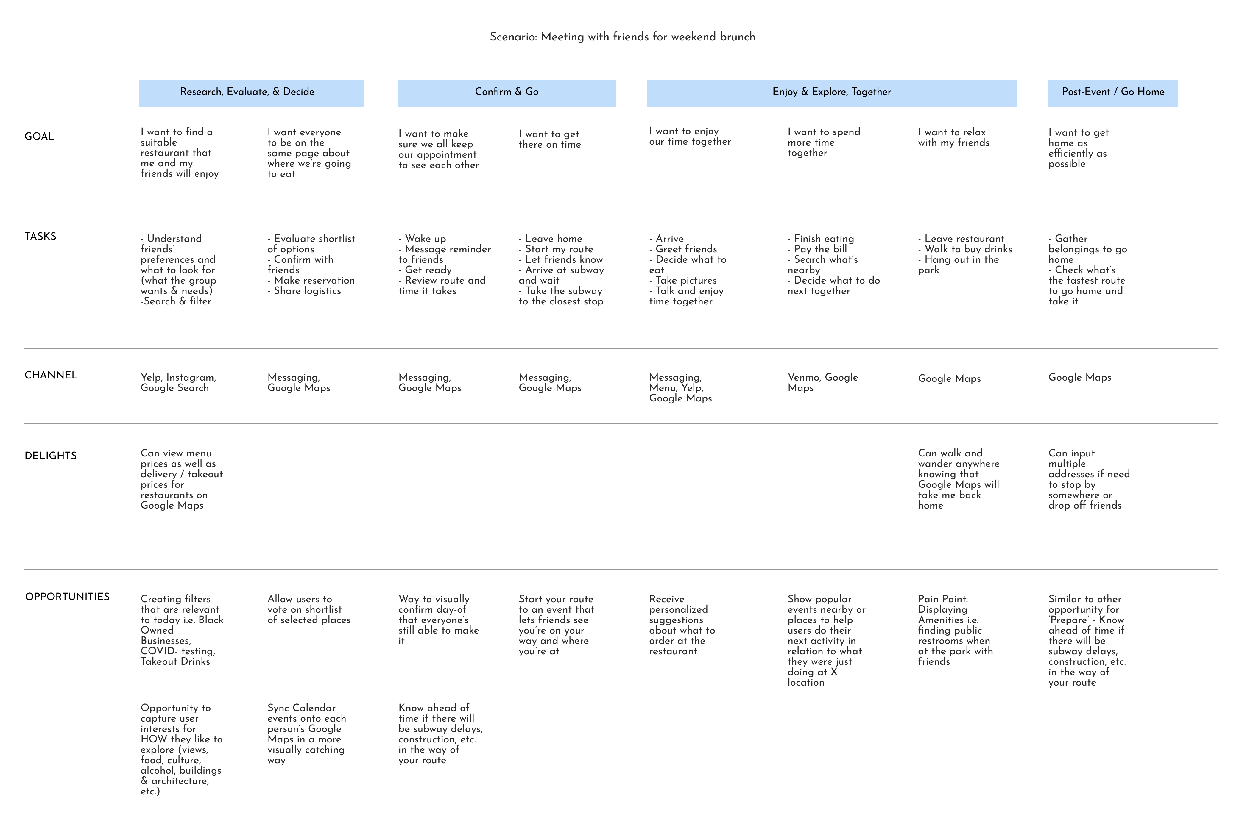
User Journey Map
Using insights from the interview, I created a user journey map to understand a common scenario discussed during interviews - meeting with friends at a restuarant. With this scenario in mind, I mapped the user goals, tasks, channels, delights, and opportunities at each stage.
DEFINE & IDEATE
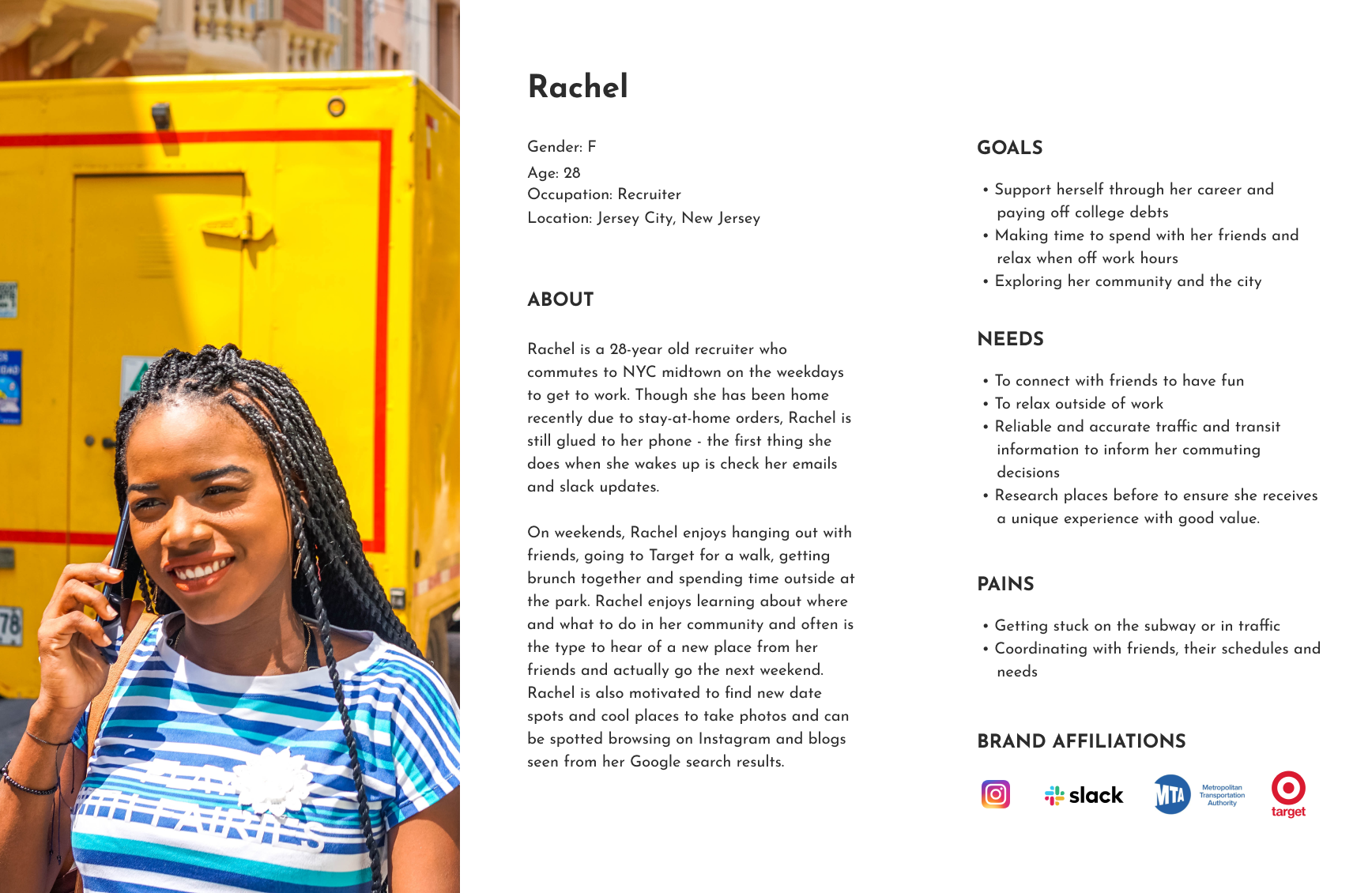
User Persona
From synthesizing user interviews as well as market research, I found shared goals, needs, and pains that I would have to address leading me to build my primary user persona, Rachel.
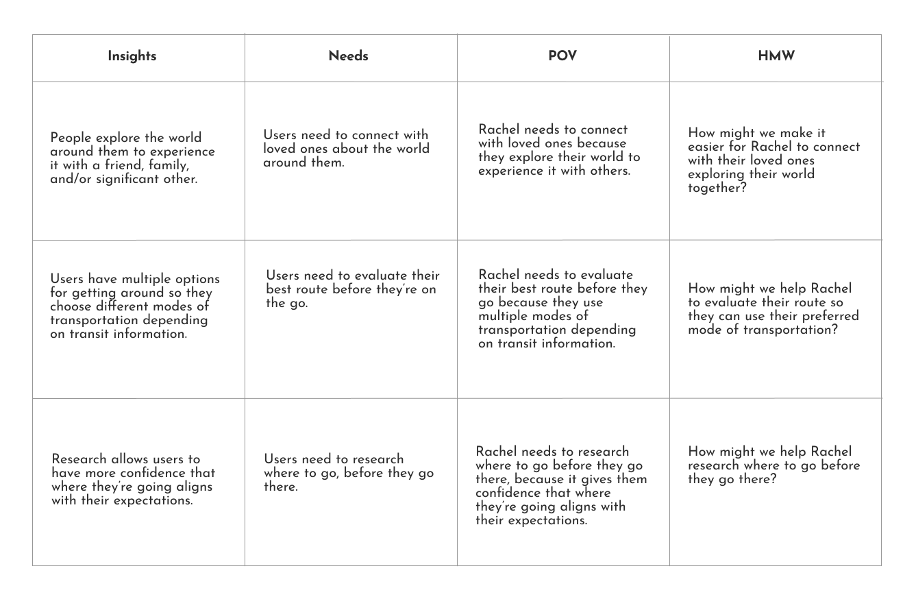
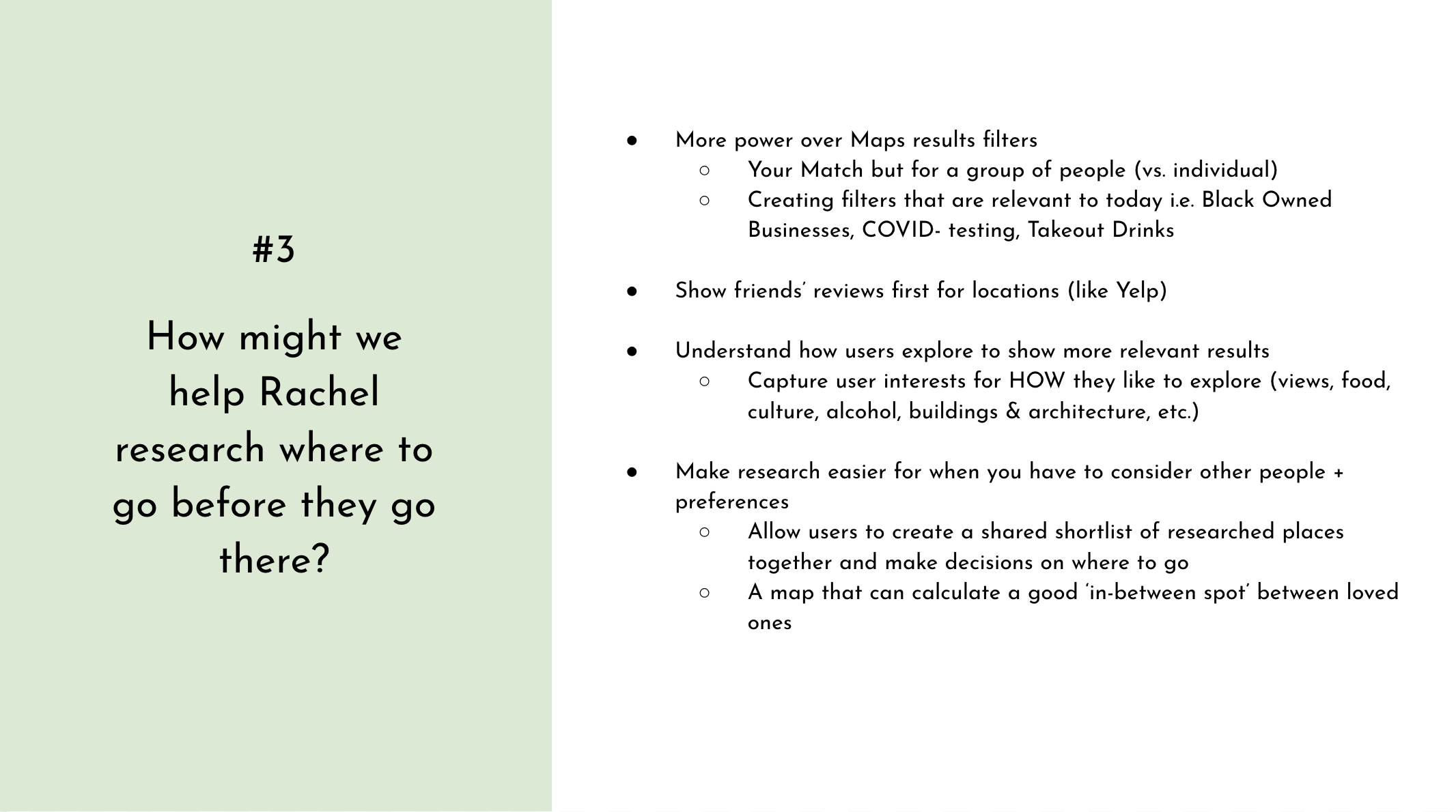
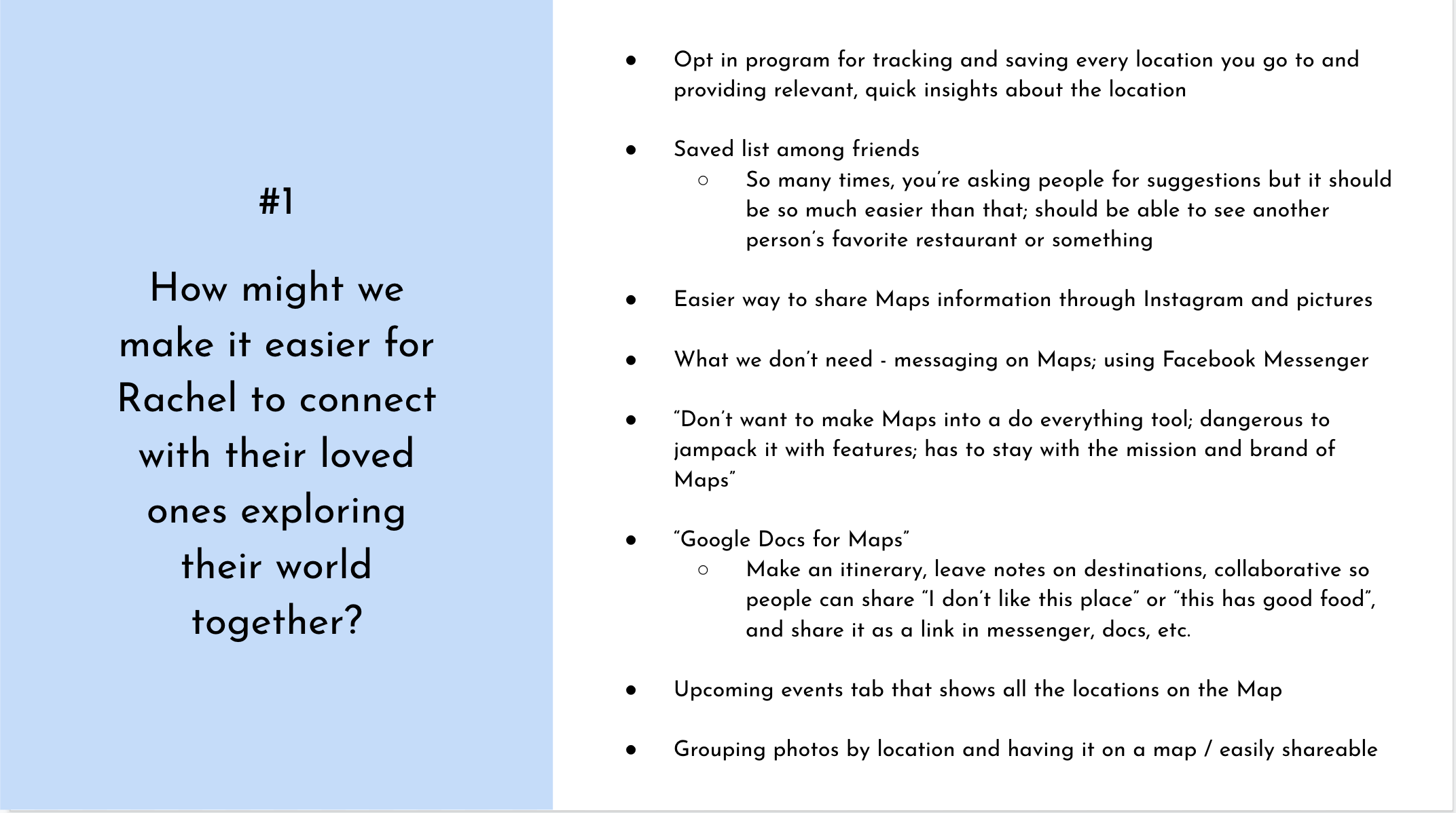
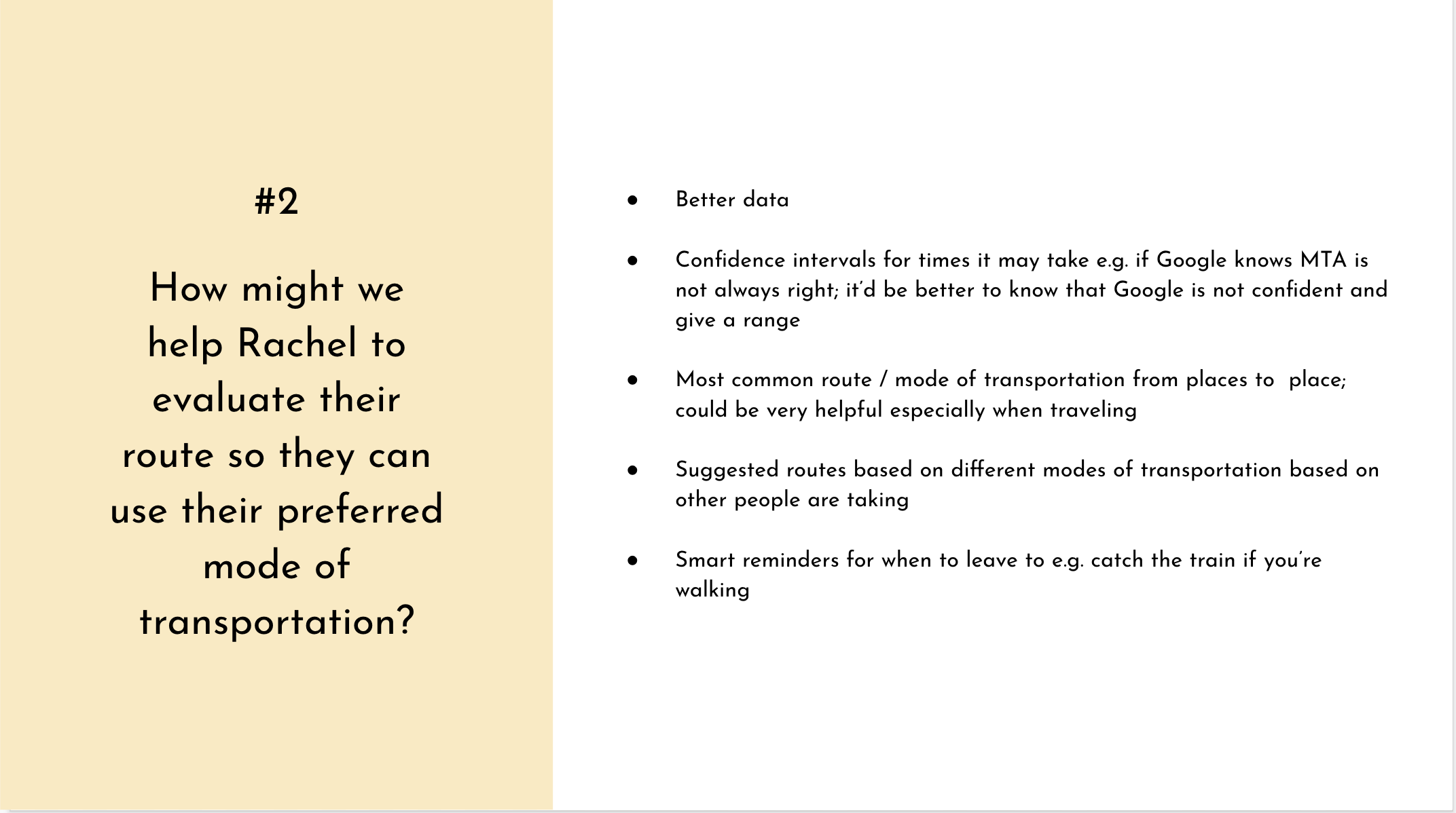
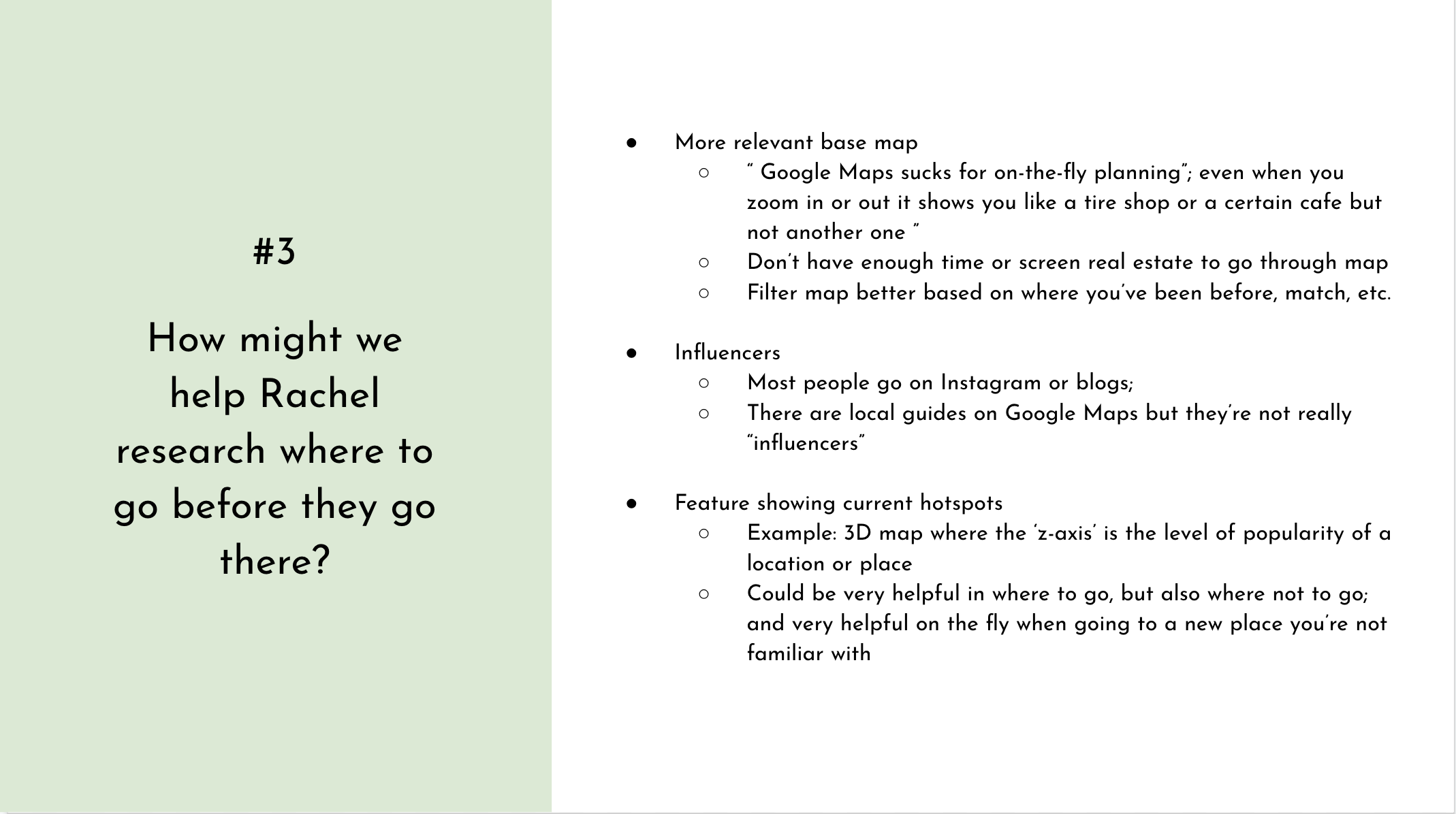
POV + HMW
With the needs and insights uncovered from user interviews and the user journey map, I articulated Point-of-View (POV) statements structured as: "user needs [verb] because [insight]". Forming POV statements would ensure that I'm solving for relevant problems to address for users like Rachel. I then reframed the POV statements into How-Might-We (HMW) questions to help spark ideation.
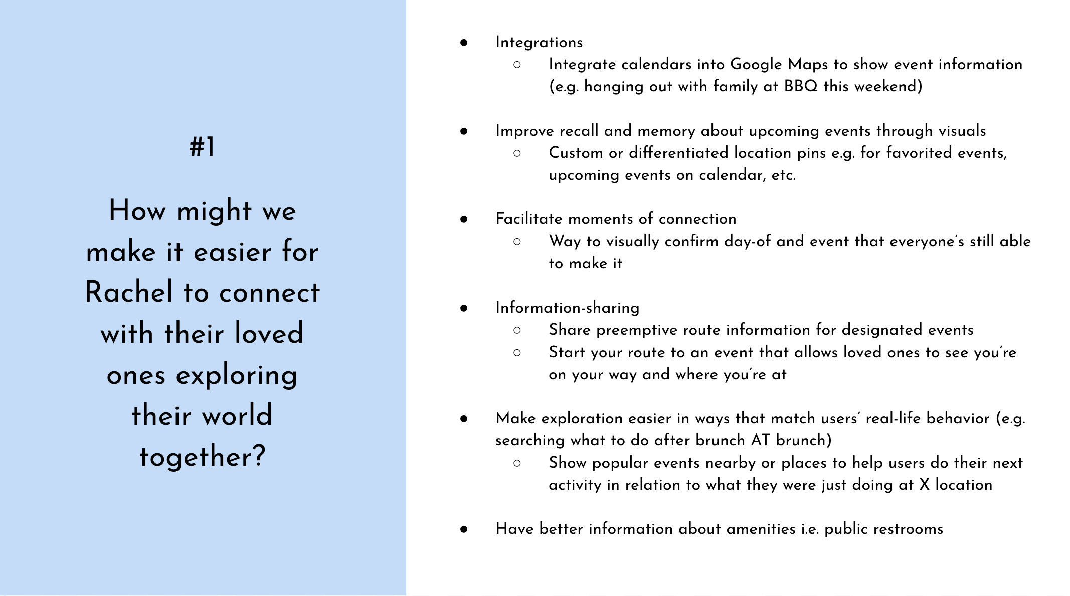
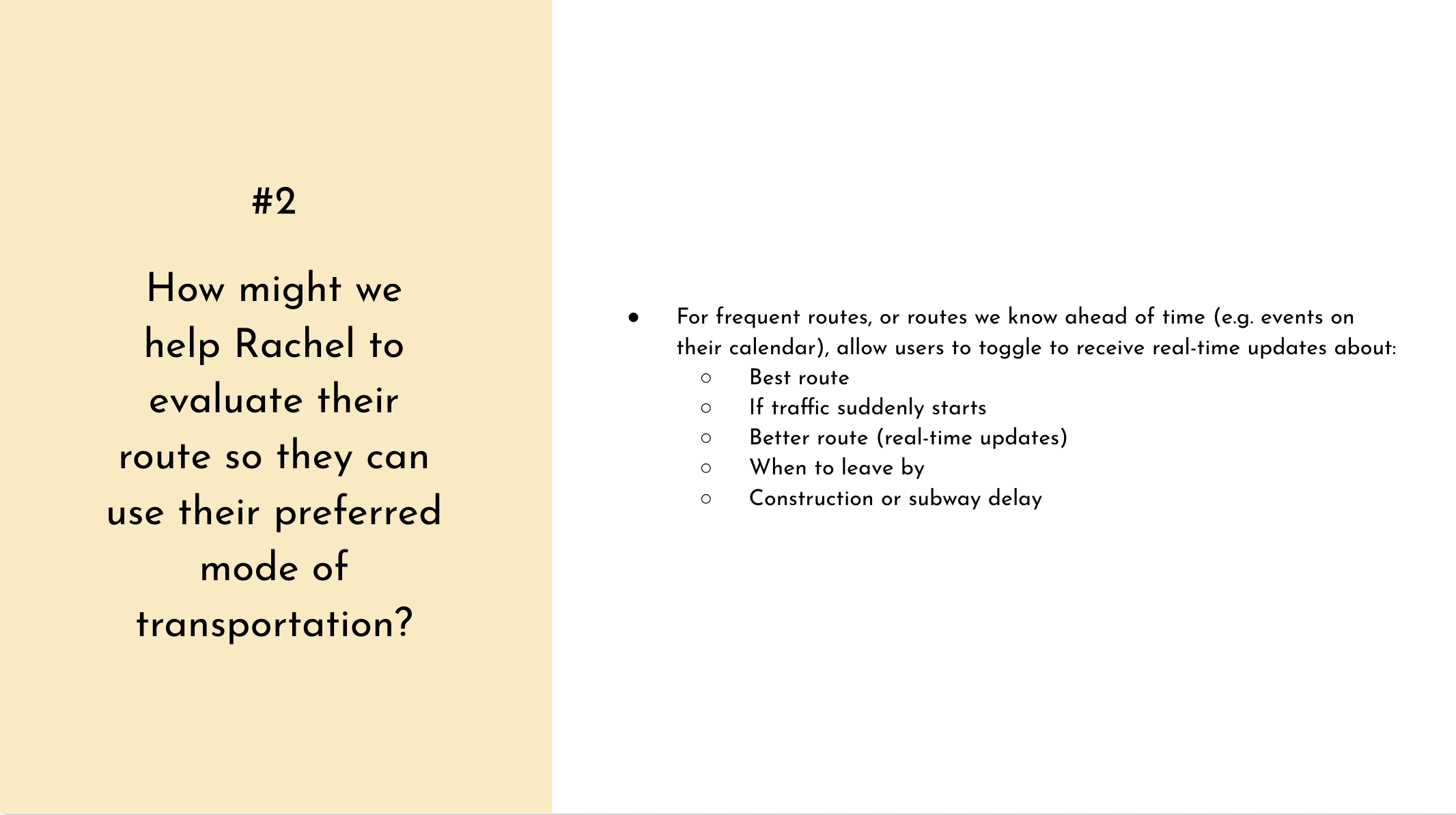
Rapid Ideation (solo)
At this point, I had so many ideas because Google Maps is one of my favorite products! Even with that excitement, I wanted to make sure that I'm addressing the needs that came directly from users that I interviewed. Thus, I started my ideation process with the three How-Might-We questions and the intrigue I developed for maps through this research - primarily the idea that a map being centered around YOU is quite a new concept.
Rapid Ideation (group)
To dive deeper into the ideation process, I wanted to source ideas from people other than myself in order to gain fresh perspectives. To do so, I conducted a group brainstorming session over Google Meet with 2 participants. I shared details about the brief, user interviews, and the problems I wanted to focus on for Rachel, my user persona. This small group produced some ideas I would never have thought of, as well as some very futuristic ideas that I'd love to see technologically advnace to for the actual product.
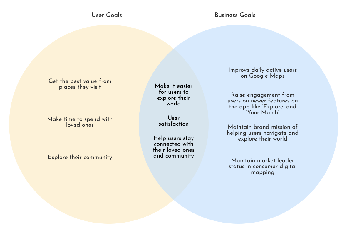
User + Business Goals
At this point of the project, I had a solid understanding of users and their goals with Google Maps but before I jumped into the rest of the design process, I wanted to reflect on the brief which shared the business goals along with the research done up till this point. Deriving user goals from the user persona and business goals from the brief and market research, I was able to find shared goals that considered both stakeholders - this was where I'd focus on creating to ensure I'm meeting the needs of both groups.
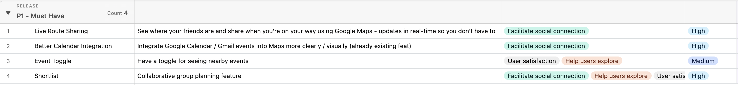
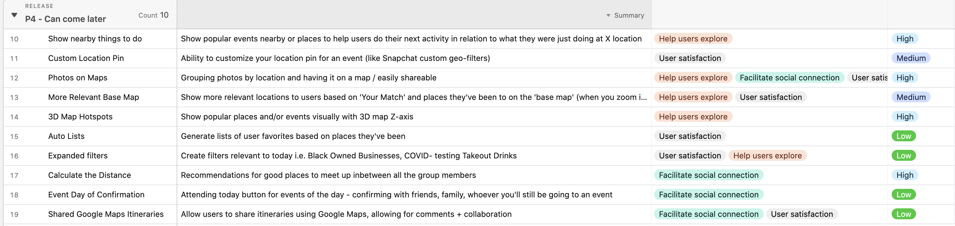
Product Feature Roadmap
With a plethora of ideas generated from my solo and group ideation along with three shared key goals between users and the business business, I needed a way to prioritize which features to build into my design. I approached this by using Airtable and bucketing the features into different priority levels (P1 to P4).
As I had limited time and resources with this projec and there were a few features that would require a lot of new technology and time I was able to categorize those features into P4. I also wanted to focus on integrating events where users meet with other people - with this in mind, it was easier to bucket critical features allowing for this type of interactions with Maps into P1 and assistive features like your own avatar into P2 and P3.


INFORMATION ARCHITECTURE
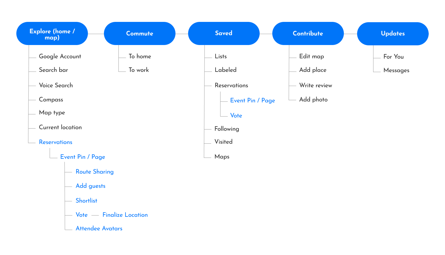
Application Map
With a clear direction for the features I wanted to build, I mapped the current navigation and structure of the Google Maps app at a high level by interacting with the app on my Android phone (#TeamPixel). I was able to understand where the new features would be best housed through this method.
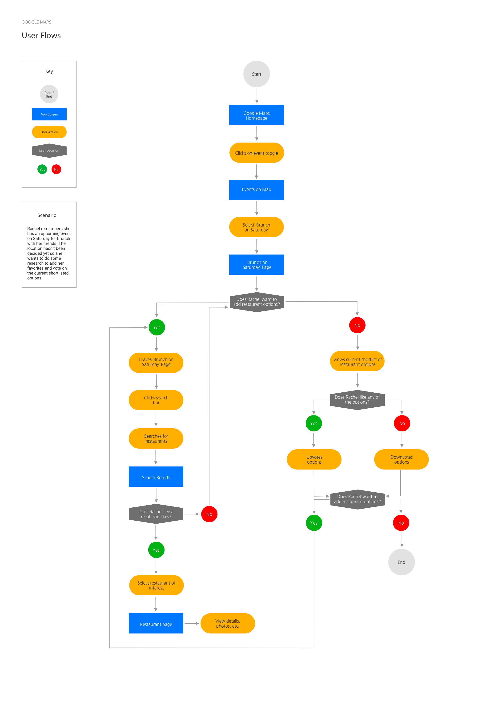
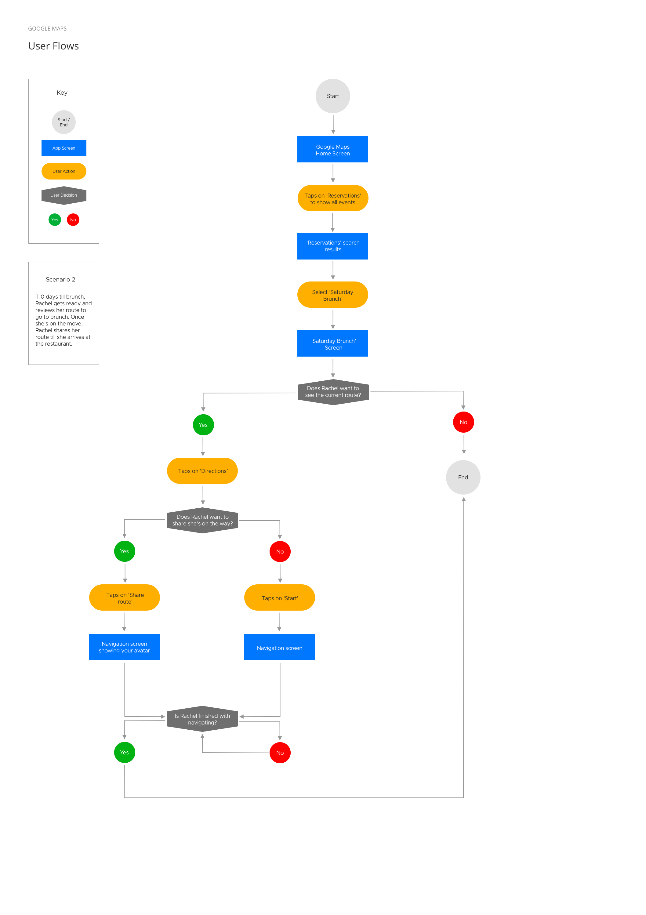
User Flows
To identify what needed to be designed I created a UI Requirements document while referring to the product feature roadmap and current Google Maps app. This allowed me to imagine which elements will need to be available for the new features to be functional for users.
With this document in hand, I considered two key scenarios - users finding location options for their events on maps and navigating to an event. I started imagining the actions and sequence of screens the user will need to accomplish key tasks through the two user flows below.


INTERACTION DESIGN
Low-Fidelity Wireframes
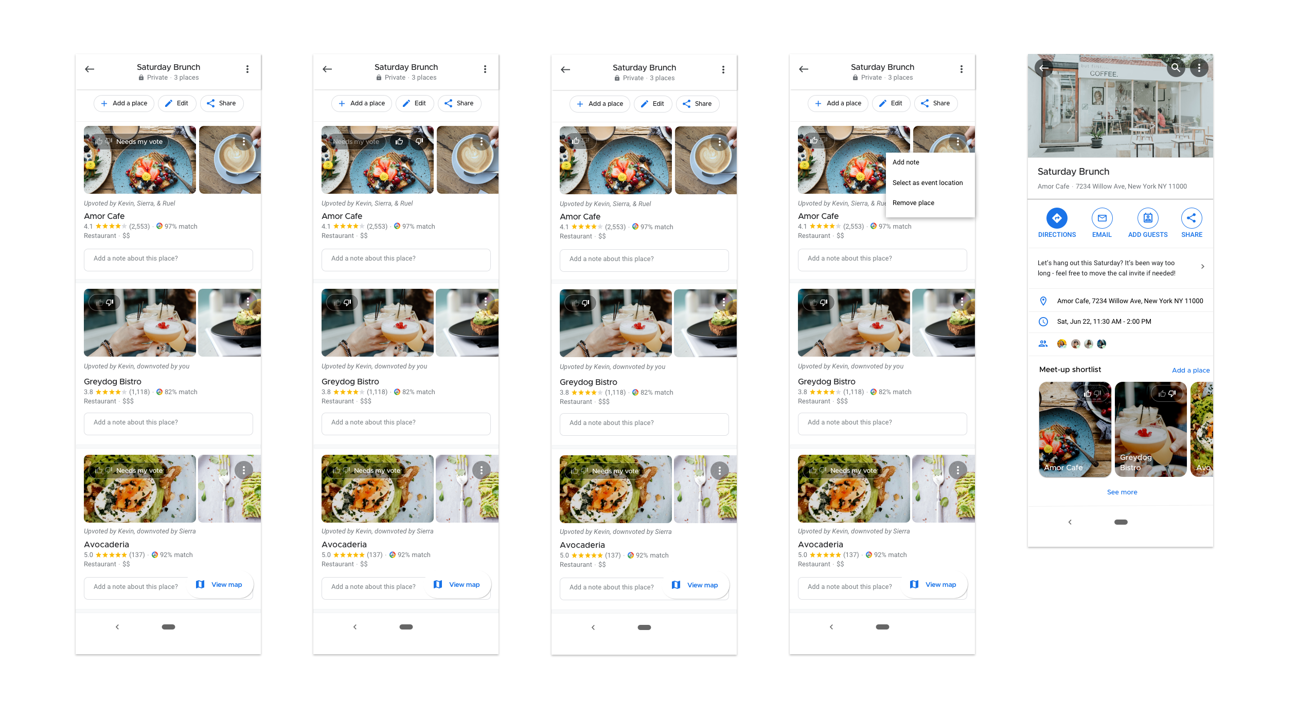
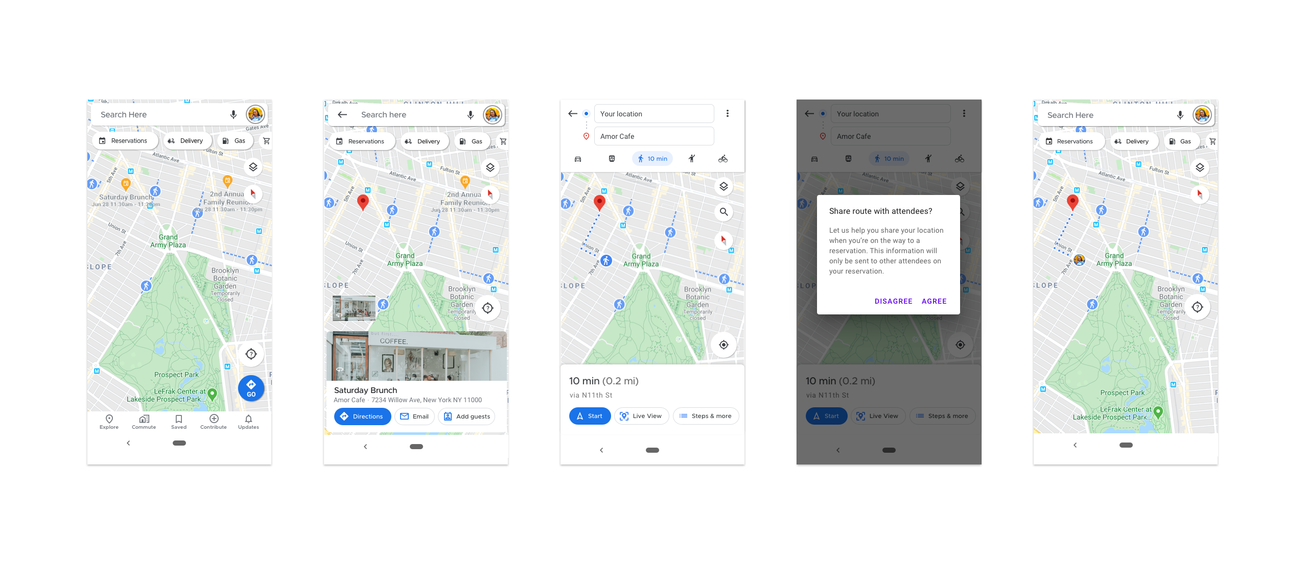
I spent some time understanding Google Maps' interface to consider how certain design patterns and elements could be reused for seamless integration. From there, I quickly sketched low-fidelity wireframes where I visualized how I could integrate events sourced from Google Calendar or Gmail into Google Maps. Further, I thought through additional features that could support this integration like voting, a location selection process and route-sharing with other event attendees.
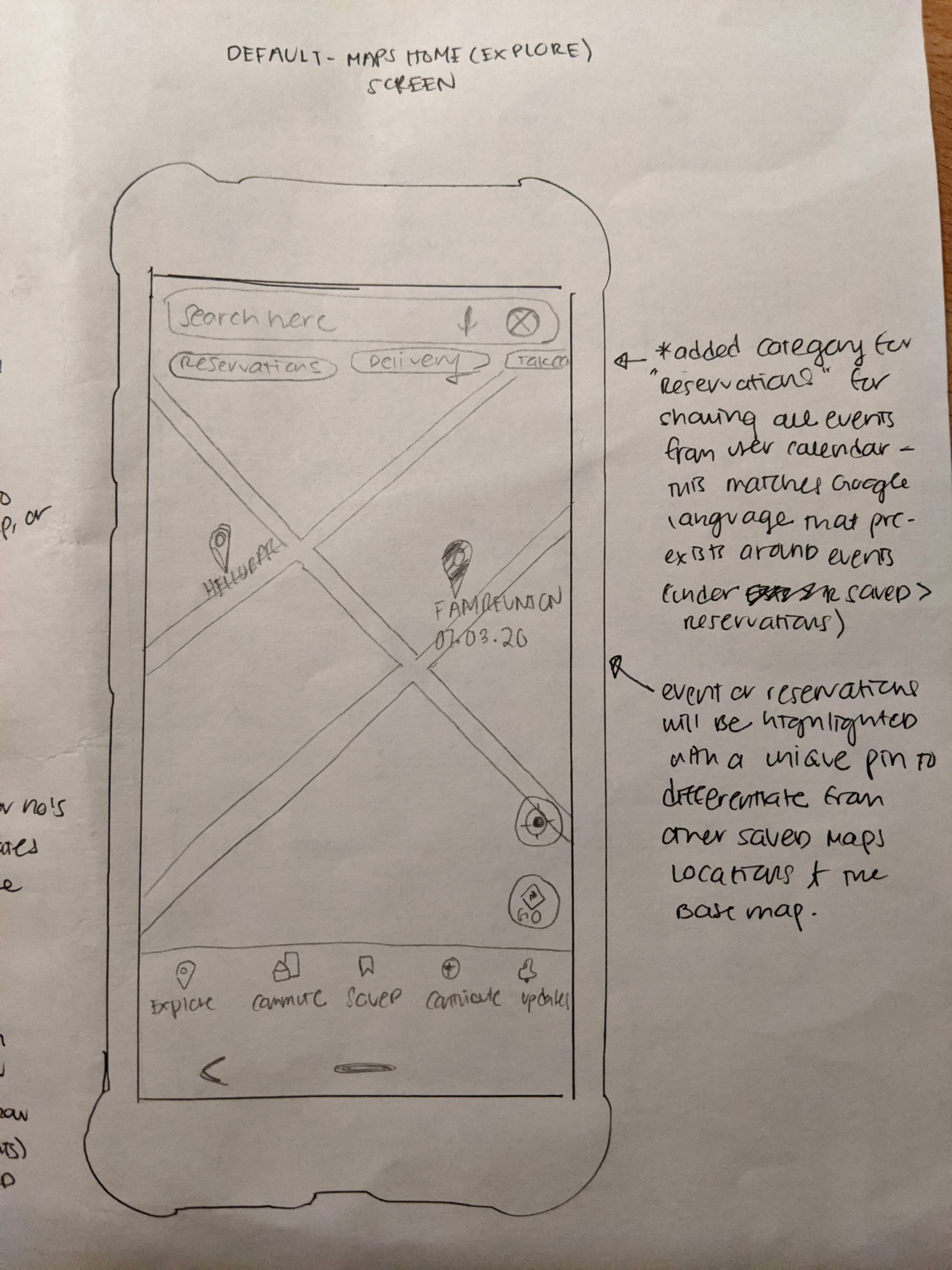
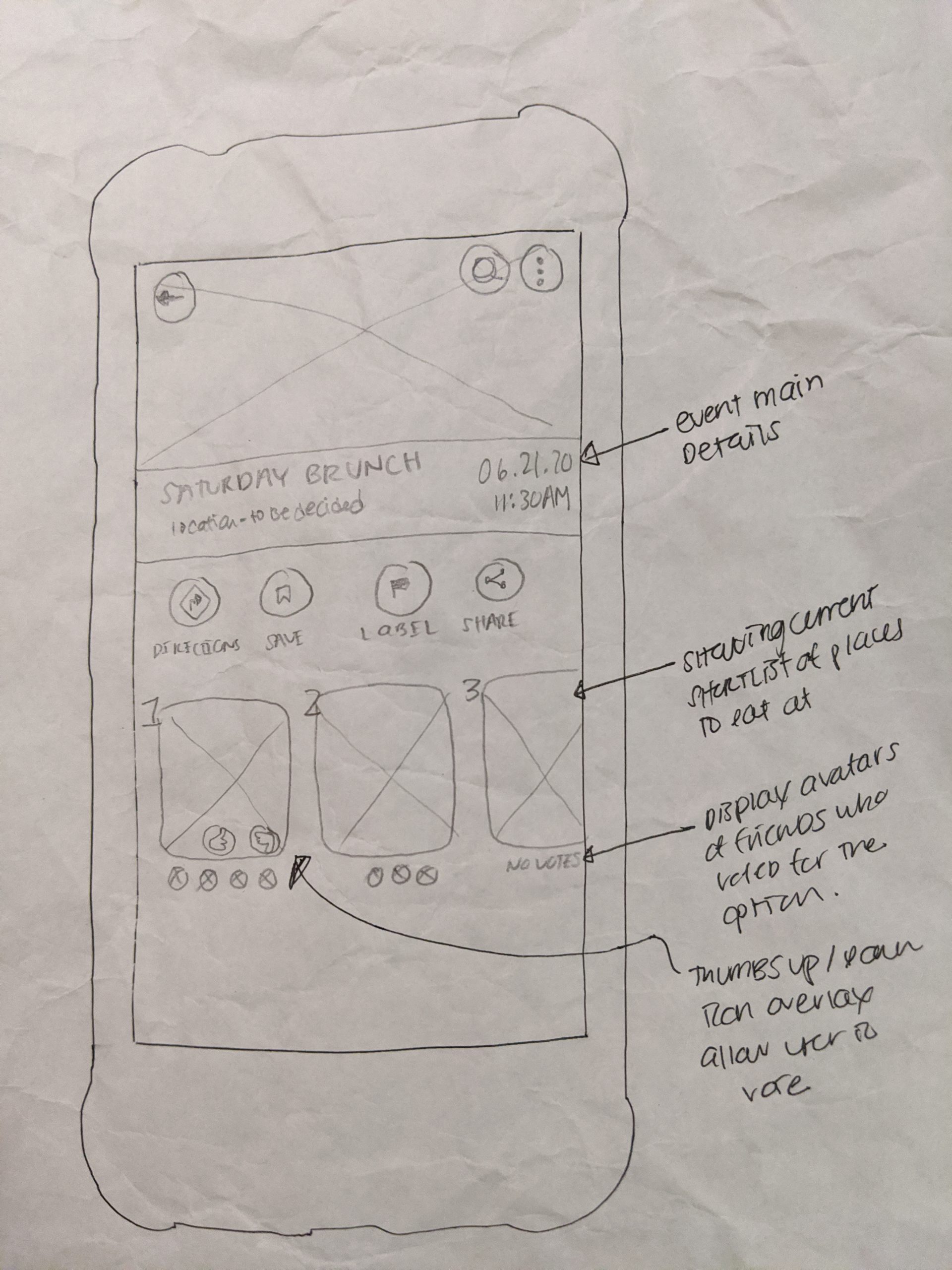
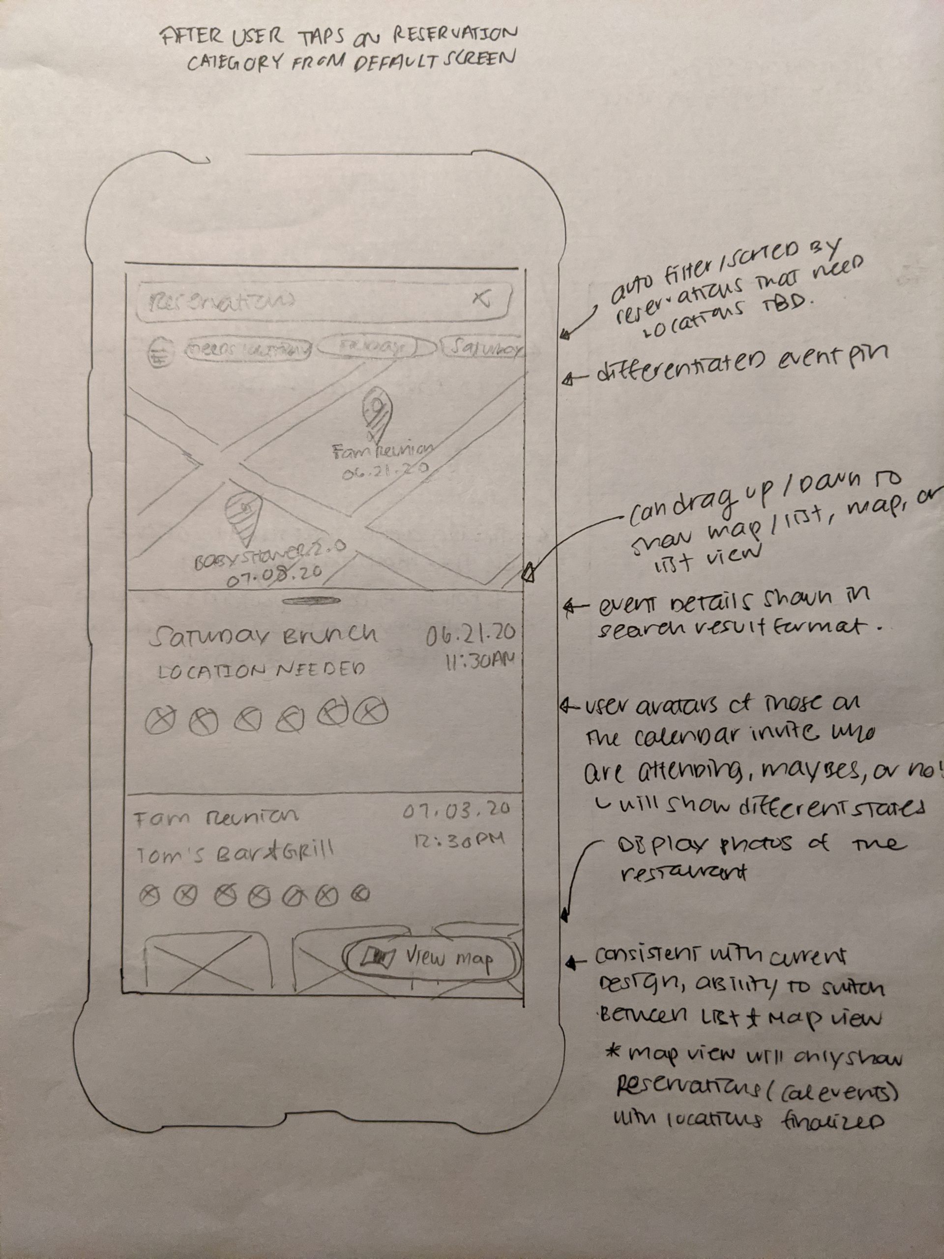
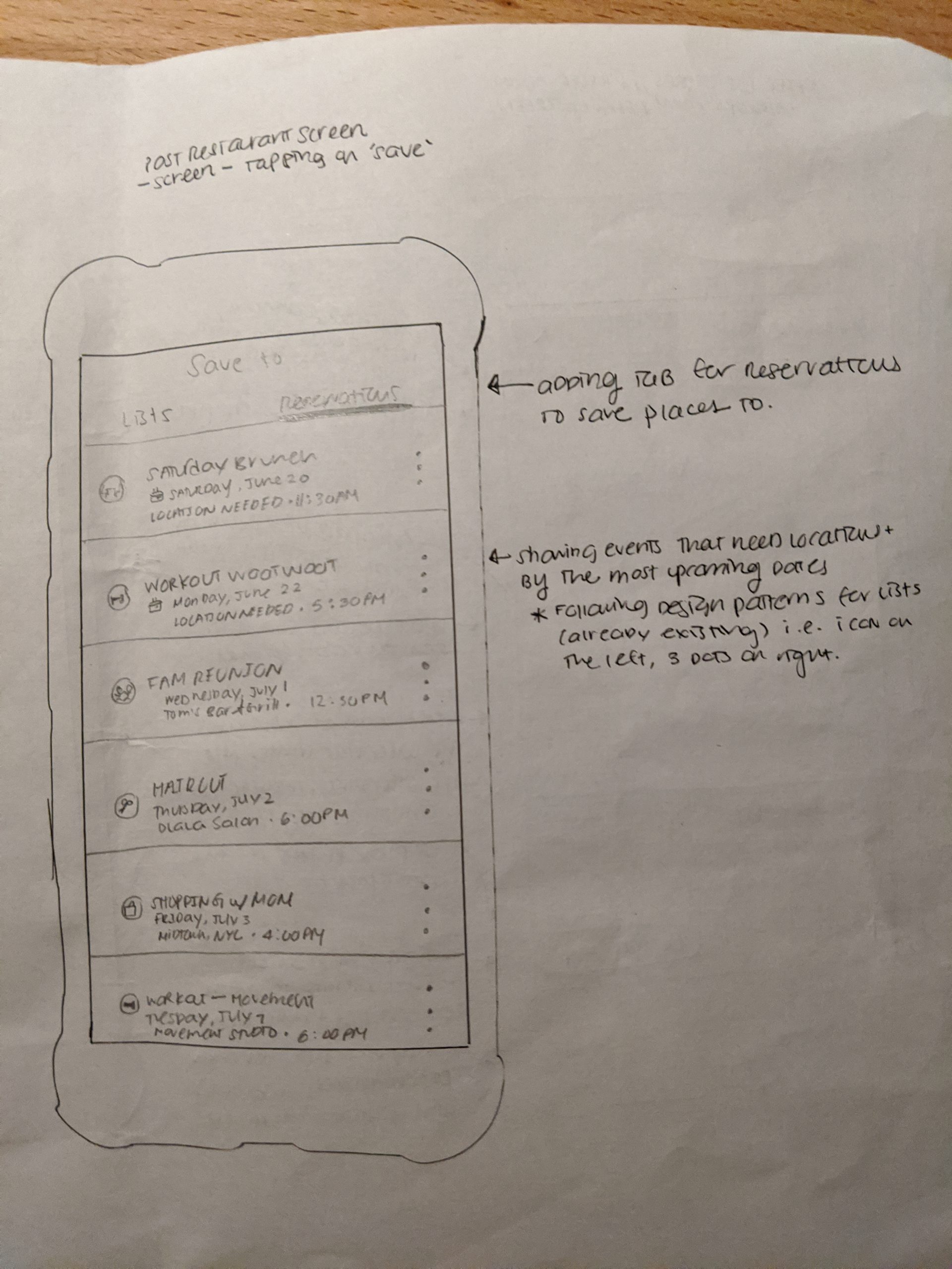
* Please don't mind my crinkled paper as I used tissue paper as I work from home through the stay-at-home orders *
High-Fidelity Wireframes
I jumped straight into creating high-fidelity wireframes after by using existing Google Material Design and having reviewed the current Google Maps app quite deeply.
PROTOTYPE & TESTING
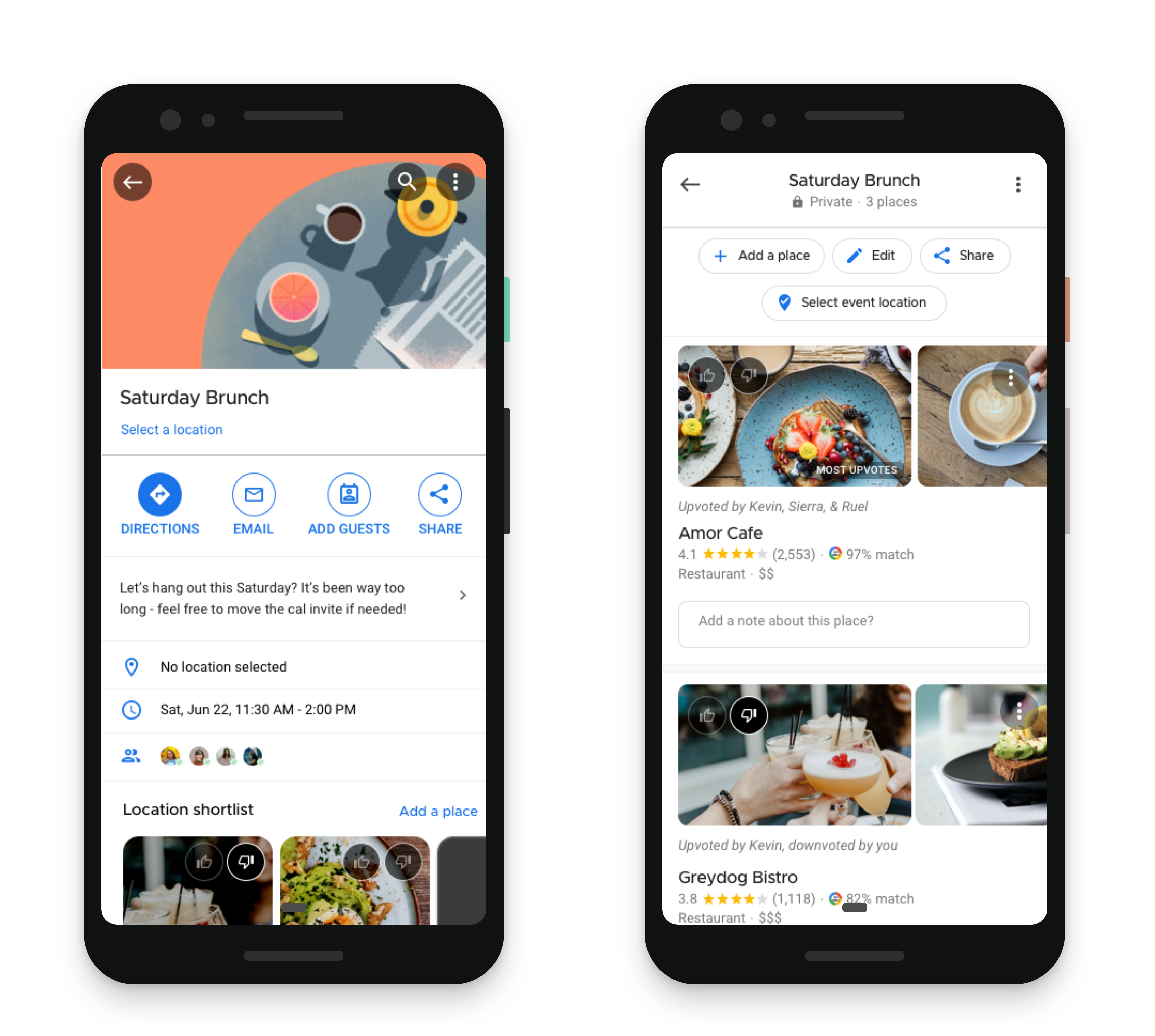
High-Fidelity Prototype
In order to simulate an in-app experience, I created a high-fidelity prototype using Invision. With this, I was able to test my designs directly with users to understand if they can complete a set of key tasks that demonstrate the functionality of the new features added.
Usability Testing
Seeking to understand if the new features were easy for users to locate and use, I led a facilitated usability test with four different participants. Participants were given four scenarios and associated tasks to perform using the high-fidelity prototype. While performing the tasks, users were asked to think aloud and share any thoughts, emotions, and feelings they experience while navigating the app.
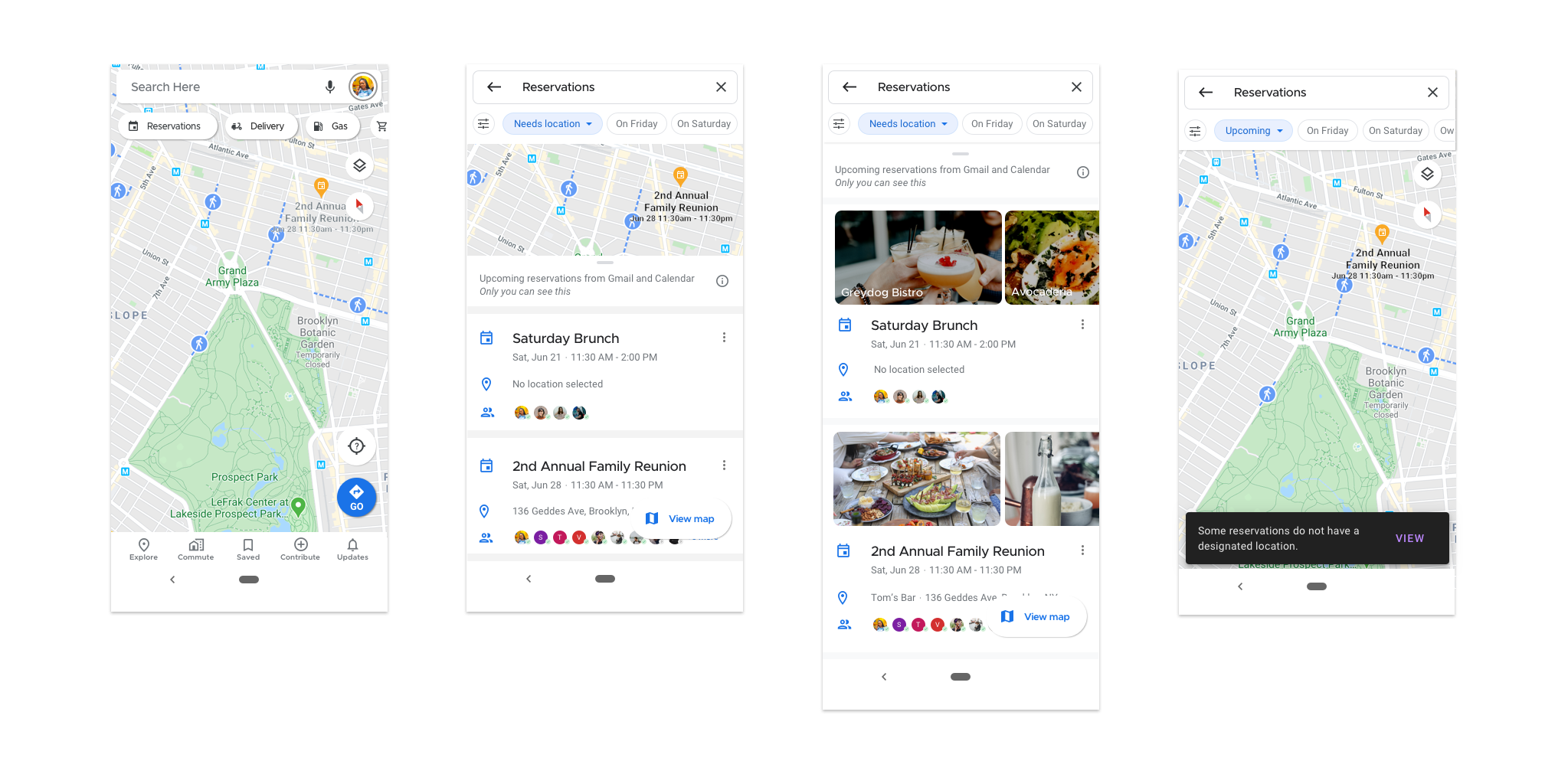
Scenario 1: You remember that you have a few upcoming reservations / events with friends and family.
- Task 1a: Find these reservations
- Task 1b: View more details for the Saturday Brunch reservation / event
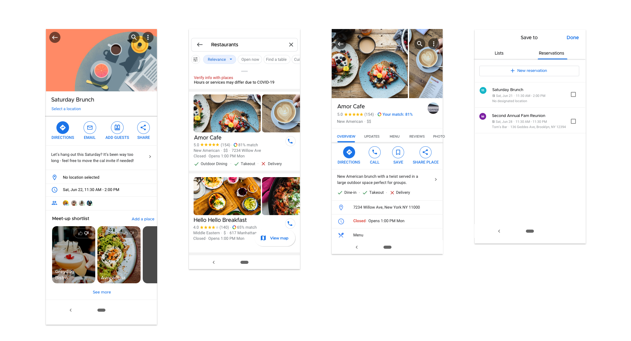
Scenario 2: There’s no restaurant selected for your upcoming brunch event with your friends.
- Task 2a: Search for a restaurant that may be suitable for the event
- Task 2b: Save Amor Cafe as a location option to the Saturday Brunch reservation / event
Scenario 3: Saturday is quickly approaching and you and your friends want to make the final selection for the restaurant choice for your meet-up.
- Task 3a: You favor Amor Cafe since you added this as an option, can you upvote this location?
- Task 3b: You see that Amor Cafe has the most votes after you voted - Can you mark this location as the designated location for the event?
Scenario 4: It’s Saturday morning and it’s time to get ready for your brunch reservation. You’re heading out the door and ready to navigate to Amor Cafe.
- Task 4a: Can you find the ‘Saturday Brunch’ event on the map?
- Task 4b: Start navigating and share your route with the other event attendees.
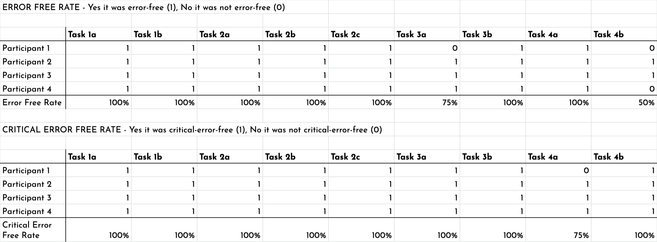
Usability Test Observations & Findings
As users were completing tasks, I wrote down my observations, their thoughts, and the actions they took on the app and compiled these observations into an affinity map. See the affinity map, here.
Overall, users were able to complete all tasks with a high error-free rate and this signaled that the design was quite intuitive and flowed well within the existing architecture of the app.
Task Completion Rate: 100%
Error-Free Rate: 96% (3 minor errors (slips), 1 major errors (mistakes))
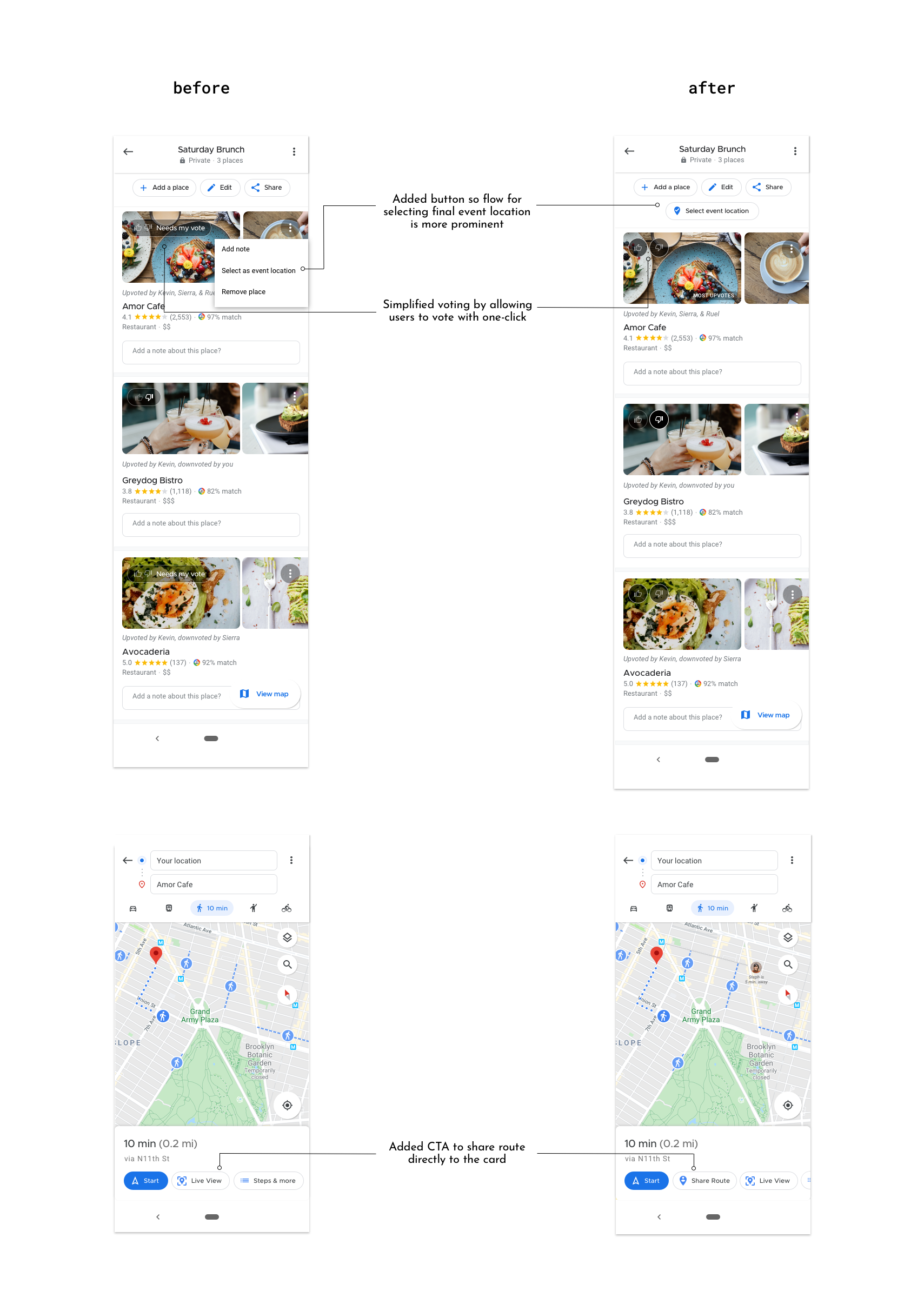
Revisions
Overall, participants shared the sentiment that it was quite easy and intuitive to complete most of the tasks. The main feedback given during the test was around the voting experience as well as the route sharing experience. Namely, users wanted voting features to be made more visible and require less clicks and effort. For the route-sharing experience, some users found it hard to find the feature because it was nested within the 'Start' button instead of having its own separate button.
View the revisions made from the affinity map insights below:
UPDATED PROTOTYPE
With all revisions made to my design, here is the updated prototype. Please tap anywhere on the prototype to interact with it.
* If you'd like, please access the prototype directly in Invision here (password: sarara) *
REFLECTIONS
I began this project not fully knowing what to expect as I was accustomed to designing from scratch. From this experience, I've certainly learned that designing for a pre-existing app comes with its own set of challenges. While I didn't have to create a brand or have a dilemma over the UI colors, there was a lot of upfront investment that I spent my time on evaluating the existing design patterns and guidelines.
From this project, I've learned that unfounded confidence when it comes to design can be dangerous because something that may seem beautiful and functional could still break and not work when thrown into certain context. Hence, I made it my critical mission to learn Material Design in order to make sure what I designed would actually work within the existing structures and systems of Google Maps.
This project also shed light on the challenges and honest fun around integrating different products under the same company. Thinking about how Gmail, Calendar, and Google Maps can interact was an additionally interesting design consideration to have throughout this experience.
Other considerations & ideas:
- Actions on Google Maps are very critical for the app's growth; for example, being able to reserve a restaurant or make a haircut appointment. With more time, I'd like to imagine what these flows would look like for users with the integration of Calendar and events in Maps.
- Maps and Calendar are two of Google's most popular products that have become engrained into user's lives and psyche. That said, aligning on copy and language between the two very different products I believe is critical to prevent confusion within the Google product ecosystem as well as the user experience For example, I'd like to align on language around reservations vs. events and guests vs. attendees.
Selected Works