take31, korean soul food ♡
Overview
take31 is a casual Korean gastropub that has operated since 2011 in the heart of Korean Town, New York City. take31 comes alive at night when international students, young professionals, expats and groups of friends gather to start their evening with food and drink. Despite its mass popularity and notoriously long waits, take31 has not been immune to the impact of stay-at-home orders which reduced spending on NYC restaurants by more than 90% in late March alone.
Problem
Due to the crisis, take31 has partnered with third-party platforms to offer takeout and delivery and needs a responsive website to showcase their brand and drive conversions to their third party delivery platforms.
Category
Responsive Web Design
Role
UX Designer
Timeline
May - June 2020 (80 hours)
Tools
Sketch, Invision
01 RESEARCH
02 DEFINE
03 IDEATE
04 PROTOTYPE
05 TEST
EMPATHIZE
Process: Secondary Research, Primary Research, Synthesize
Secondary Research
To initiate the design process, I created a research plan outlining my goals, assumptions, questions, and methodologies to ensure I was designing based on validated research as opposed to my own biases. My overall research goal was to learn more about restaurant-goers, their behaviors and the restaurant industry to determine a provisional persona to search for primary research participants.
In performing market research, I found that the market for food delivery is massive with 60% of U.S. consumers ordering delivery / takeout at least 1x a week. These numbers are higher in urban cities like NYC where take31 operates. Further, I found that urban milennials eat out more often than the general population and prefer fast casual and fine dining over fast food restaurants. I then analyzed take31's direct and indirect competitors, mainly other Korean restaurants in New York City. From the analysis, I was able to understand their strengths and weaknesses they had as businesses and to have a solid benchmark for how other local Korean restaurants were portraying their brands and offferings like delivery online.
From my initial findings, I determined that take31's target market is urban milennials with middle to high income and was able to build provisional personas to direct my search for primary research participants.
Primary Research
After extensive secondary research and building a provisional persona, I conducted one-on-one interviews with take31's customers to better understand their needs and pain points to ensure that I'm designing in consideration of their needs,
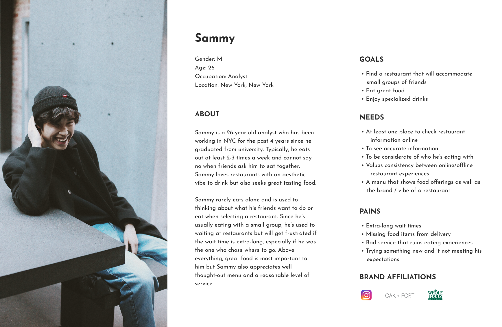
With consideration to ongoing stay-at-home orders, I was able to interview 5 different take31 patrons via Google Hangouts using a pre-created interview guide. Following the interviews, I transcribed my notes and created an empathy map with my observations. From analyzing the empathy map, I was able to find patterns among my observations to distill insights from and use to build a user persona that would serve to guide me throughout my design process.
DEFINE & IDEATE
Process: POV Statements and HMW Questions, Rapid Ideation, Business & User Goals, Product Roadmap, Sitemap
POV & HMW
Assets: POV Statements & HMW Questions
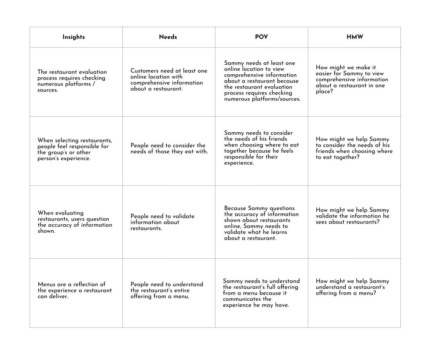
To kickoff the ideation process, I created point of view statements from the perspective of my user persona, Sammy, to alllow me to further empathize for take31's target user's needs, frustrations, and goals. Further, I developed How Might We questions that would prompt me to problem solve for Sammy's needs.
Rapid Ideation
Assets: Rapid Ideation Notes
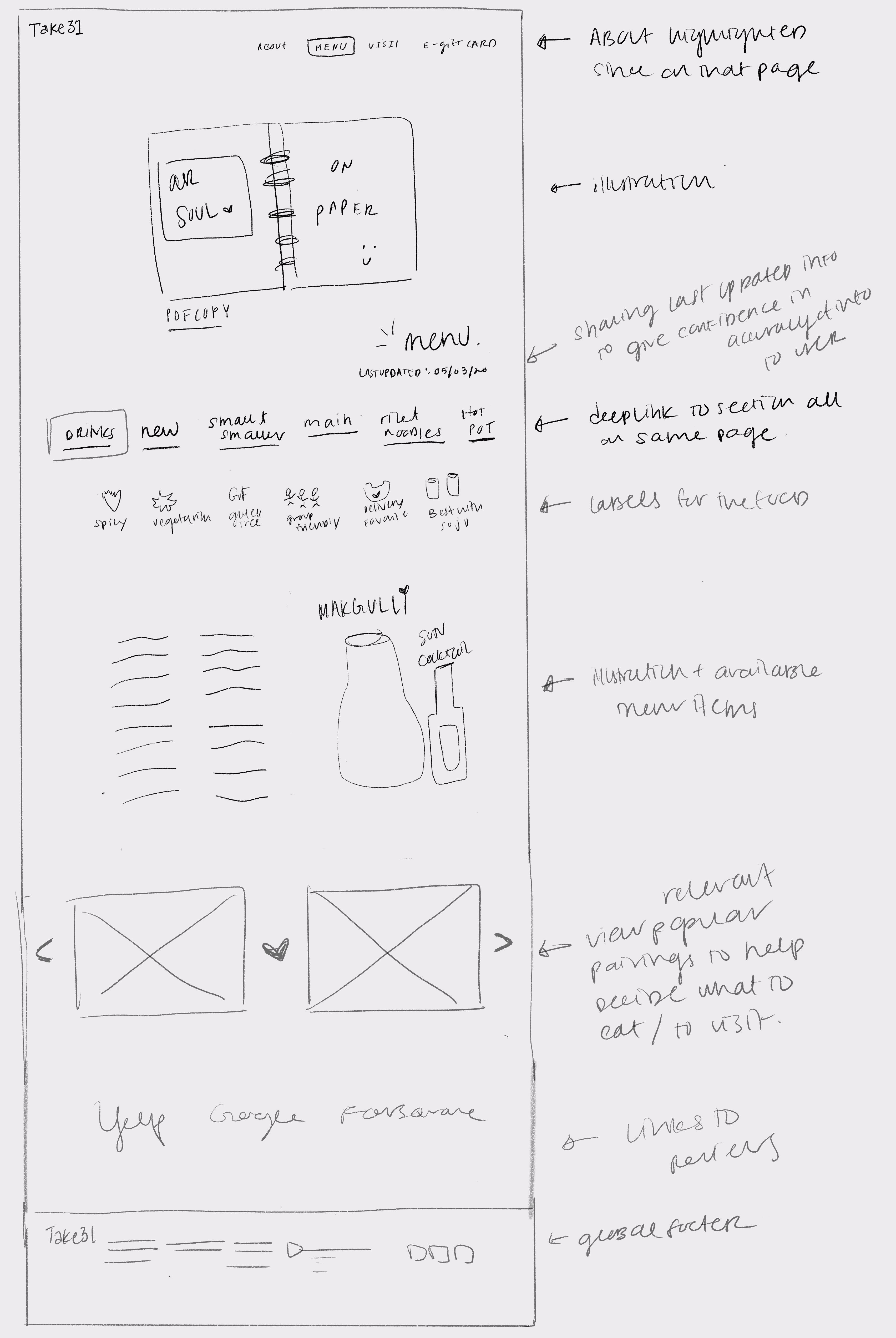
Structuring my thinking around the 4 HMW questions I had just developed, I brainstormed several ideas that would fulfill Sammy's needs. To allow Sammy to easily evaluate if the information presented is valid, I thought of textual indicators of recency of information. Further, I wanted to use the menu not only as a way to express the take31brand but also as an experience of communicating to Sammy that this is the right choice for him and a group of friends - this would be communicated through menu labels like 'good for groups' and reinforced by reviews on popular pairings from take31's very own staff.
Business & User Goals
Assets: Business & User Goals
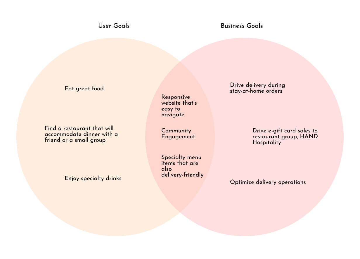
After brainstorming how to address Sammy's needs through the design, I wanted to make sure I was also considering the business needs. To do this, I looked back on the original brief to consider what take31 wanted out of the project; further, I analyzed take31's social media pages to see where they were driving traffic to: takeout, delivery, and e-gift cards. Having derived the user goals from my empathy map findings and the business goals from the above sources, I found overlapping goals which were clear areas I had to prioritize in the product roadmap and design.
Product Roadmap
Assets: Product Roadmap
In order to prioritize the features and pages for the design, I developed a product roadmap using Airtable. Using the brief, market research, analysis of competitor's websites, and user interviews, I was able to support the case for "Why?" I should build each feature with solid research. Ultimately, I assigned the different features of the design different priority levels from "P1-Must Have", "P2 - Nice to Have", "P3 - Surprising & Delightful", and "P4 - Can Come Later" features.
Sitemap
Assets: Sitemap
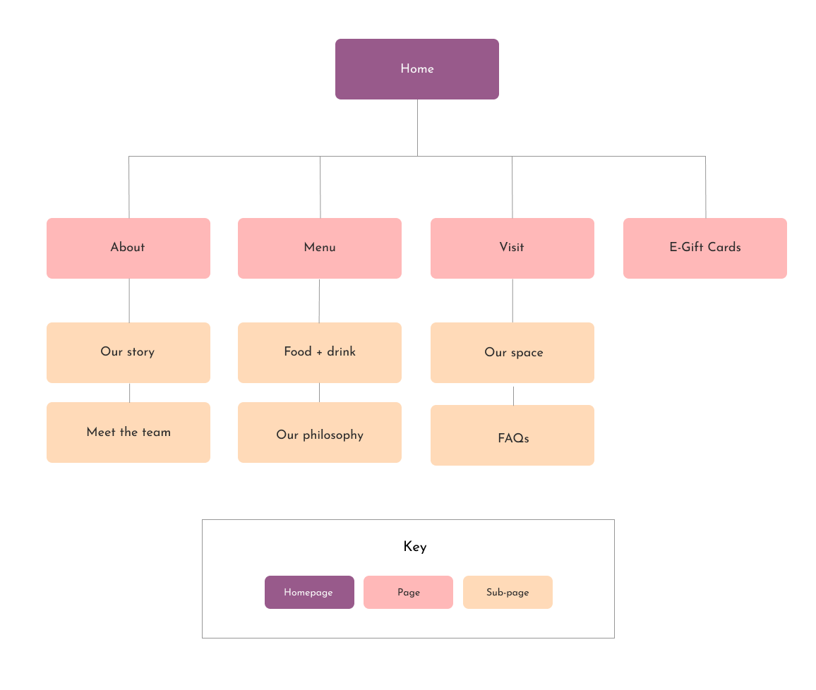
Using my product roadmap, I created a sitemap to begin visualizing and determining what to include in the navigation as well as features that may be present on each page.
INTERACTION DESIGN
Process: UI Requirements, Task Flow, User Flow, Low-Fidelity Wireframes, Mid-Fidelity Wireframes
UI Requirements
Assets: UI Requirements Document
With a strong foundation built on research, I ventured into the interaction design phase by first creating a UI requirements document to imagine what functionality would be needed on each page. By referencing the user persona for Sammy's goals and the product roadmap for a list of key features, I was able to walk through potential journeys through the sitemap and the features and information on each page.
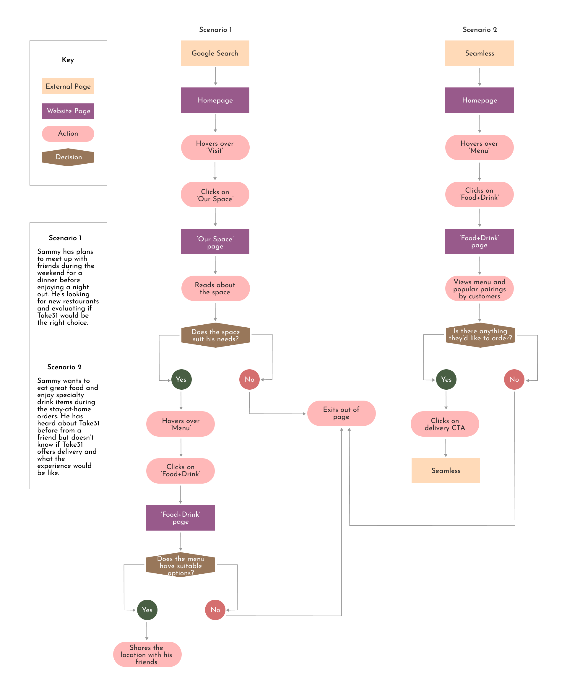
Task & User Flows
Assets: Task Flow, User Flow
With the sitemap laid out and UI requirements detailed, I thought back in Sammy's shoes (aka I looked at his user persona!) to consider what goals were important to him and how that translated into key tasks he may need to accomplish on the design. With this in mind, I thought about what the interaction and journey would be like step by step and laid this out into the task flow. I then brought in Sammy's potential interactions and thoughts he may experience translating into decisions that need to be made that influence his interaction with the site into my user flow.
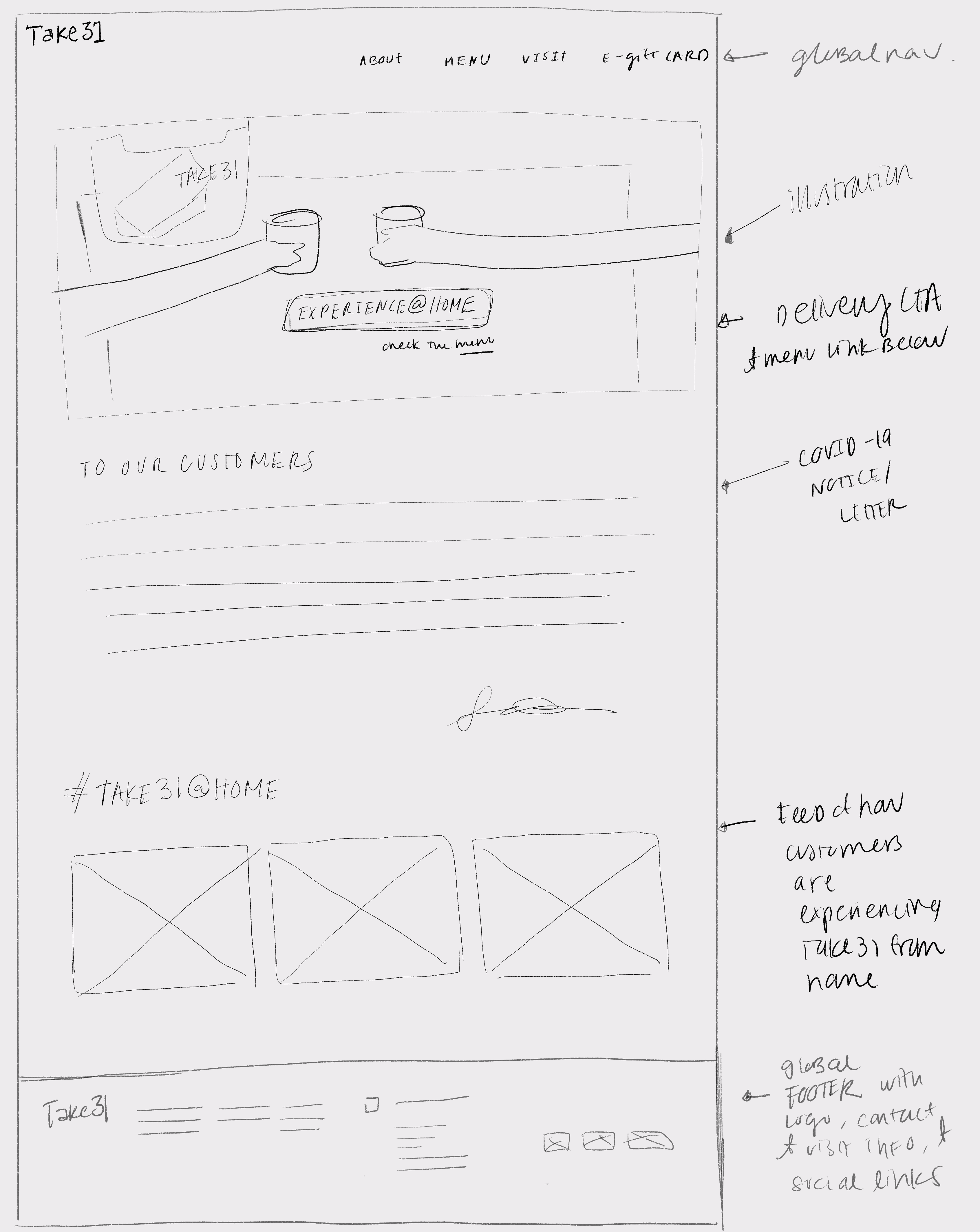
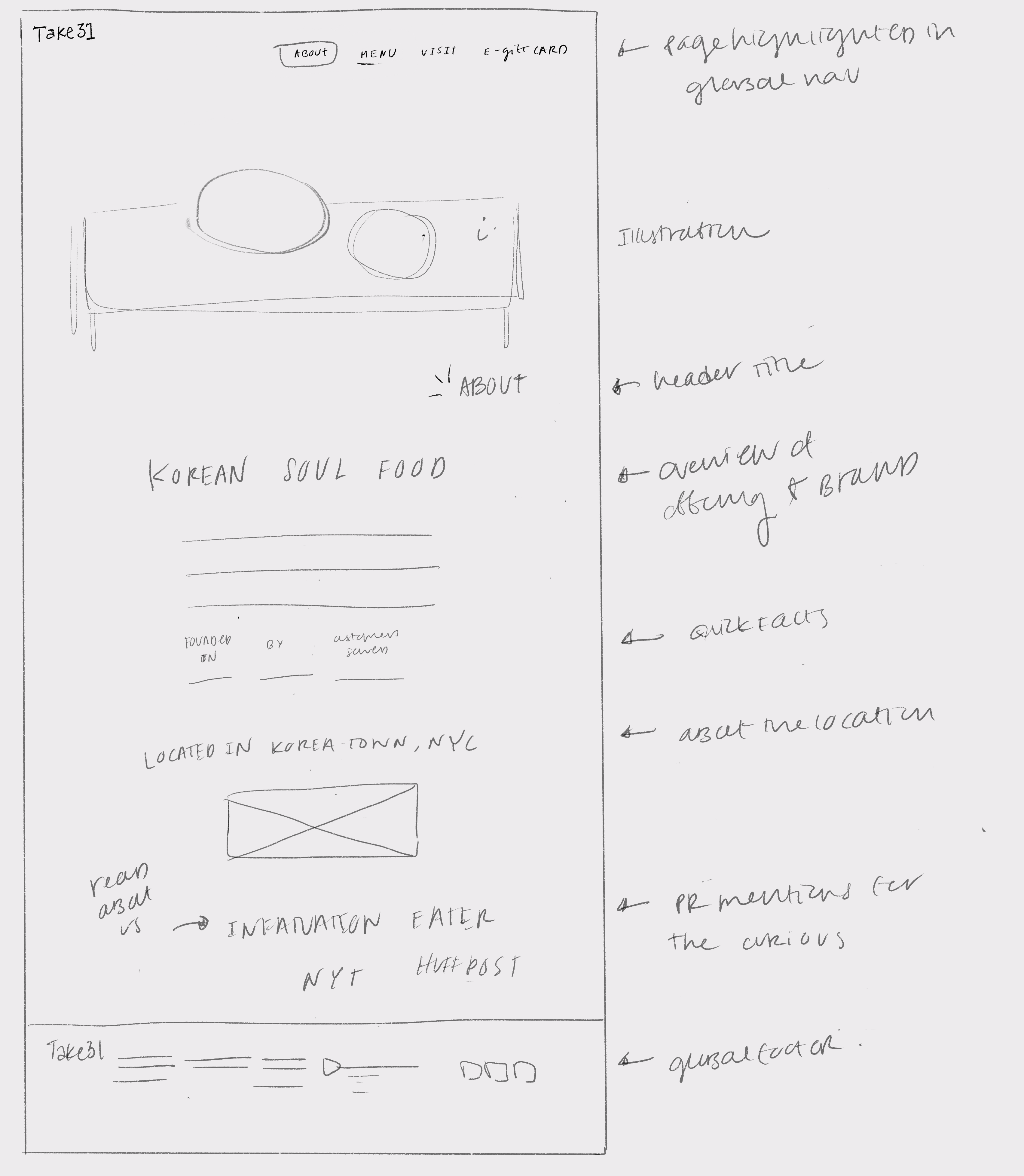
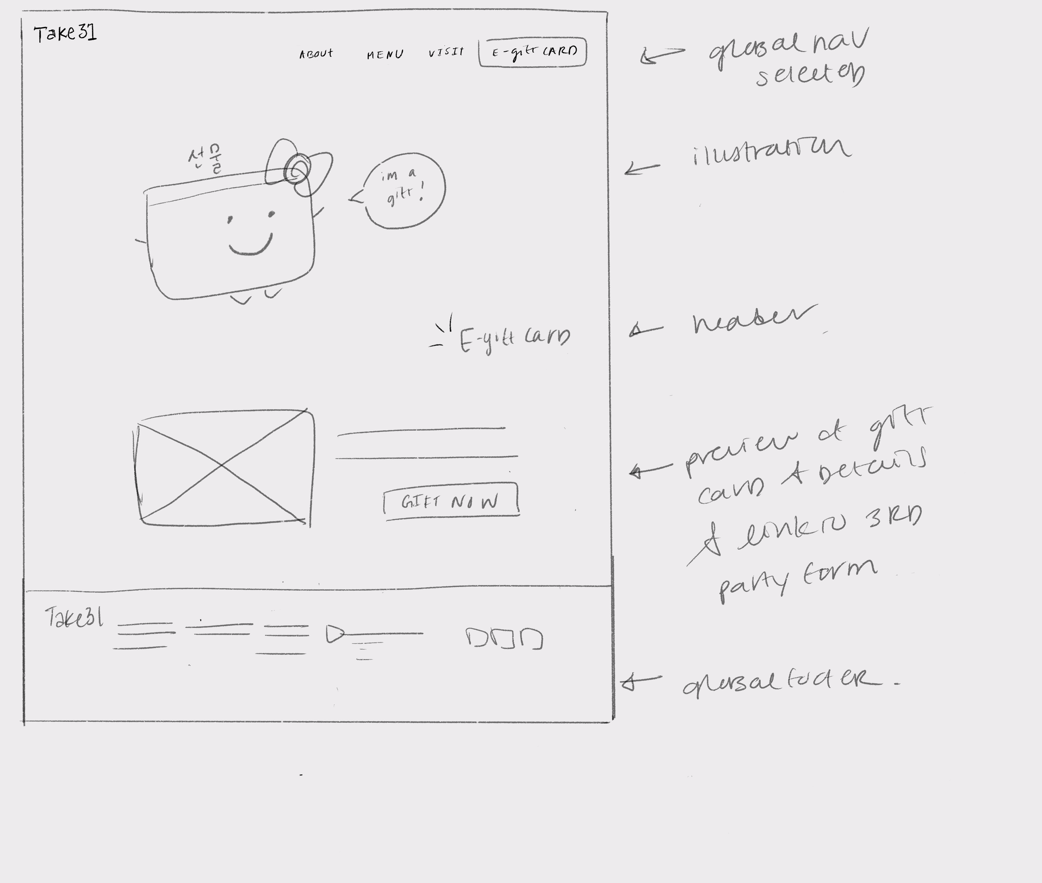
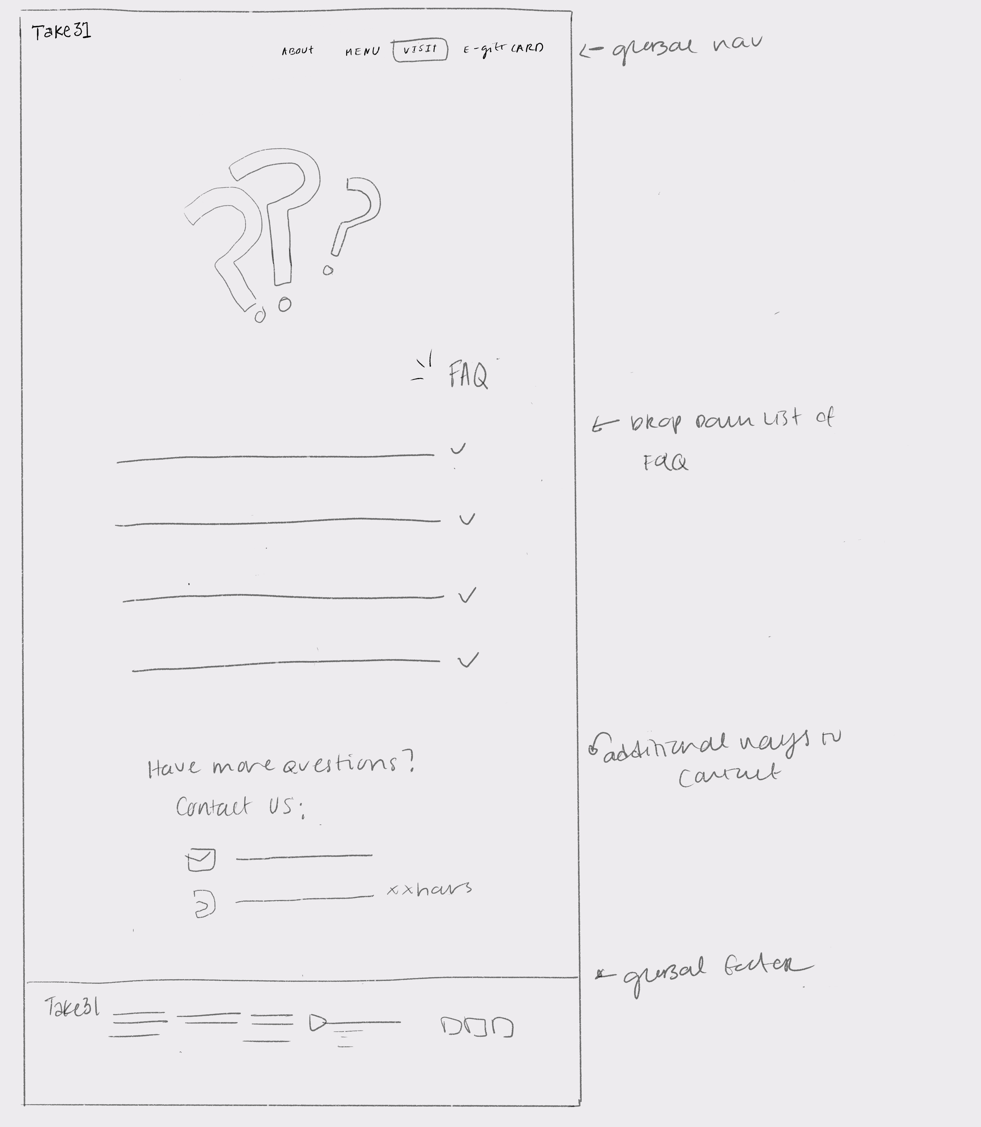
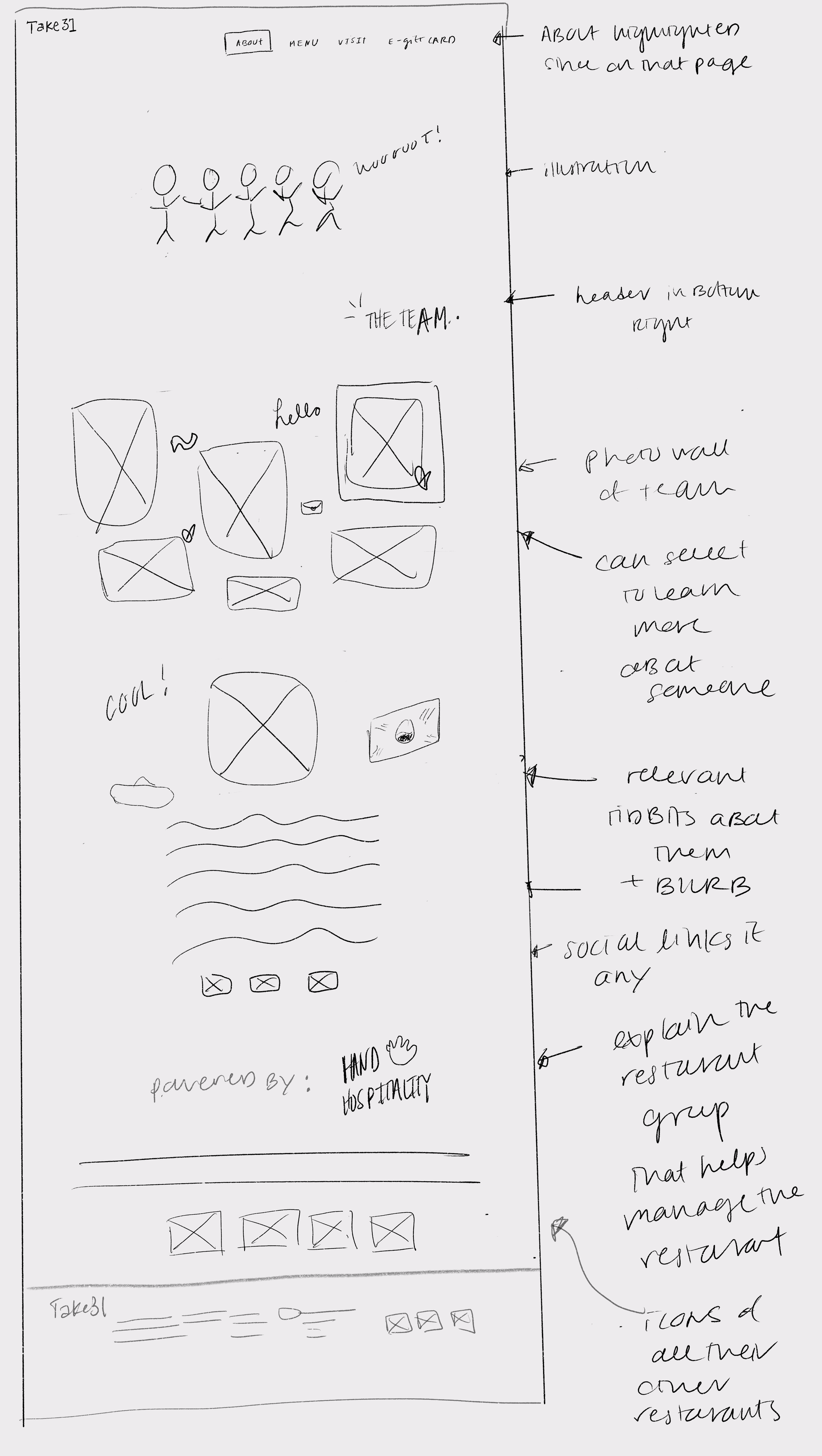
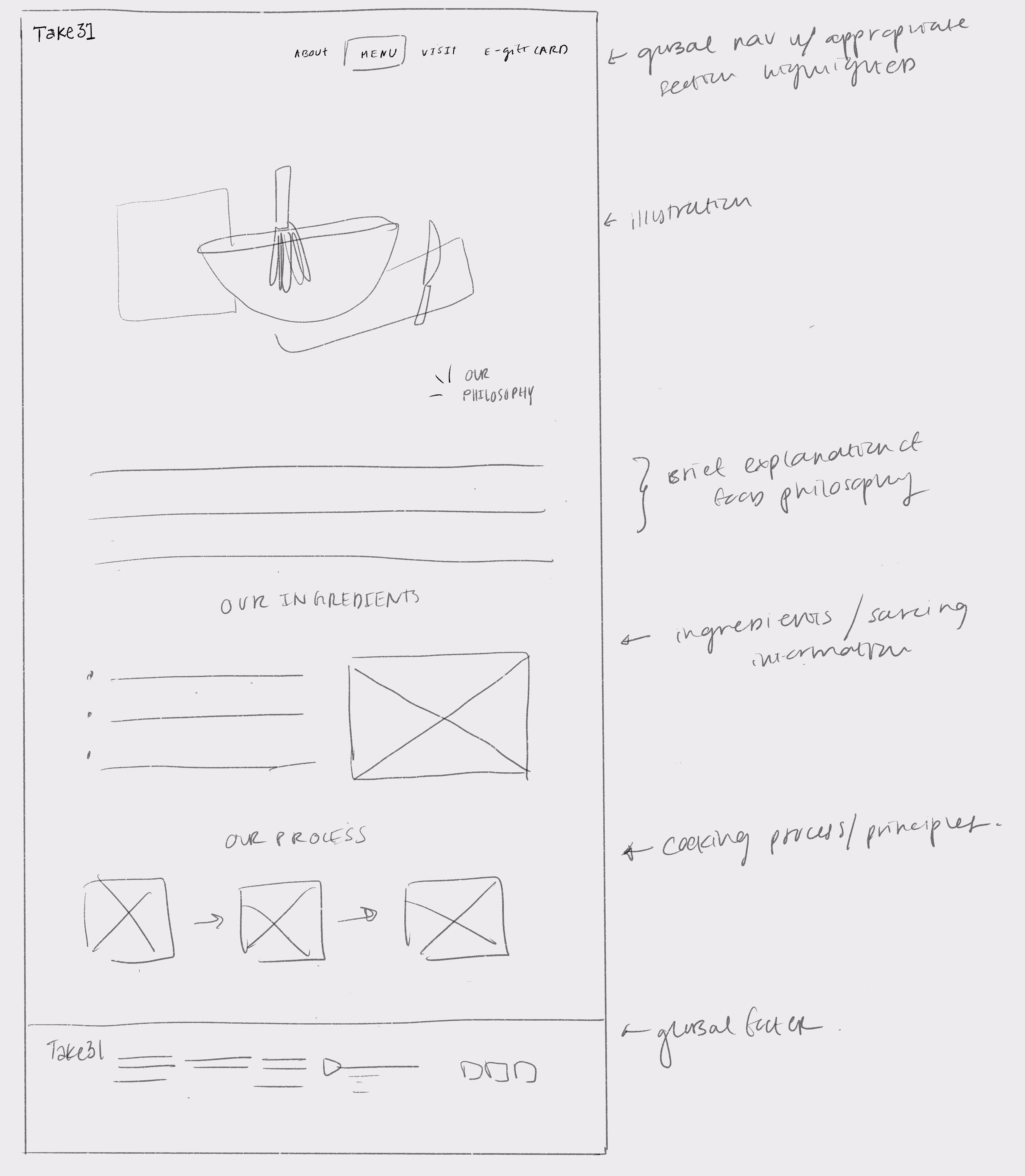
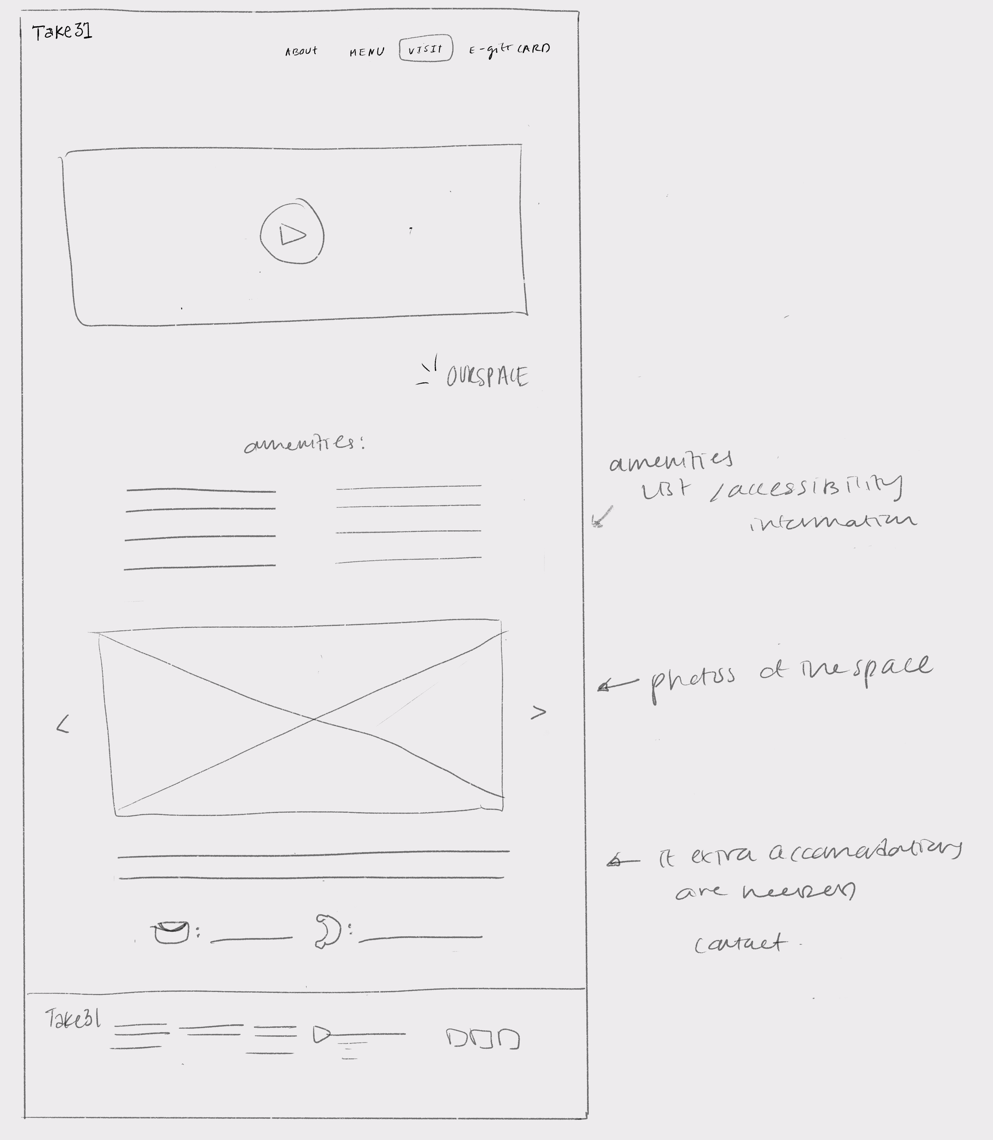
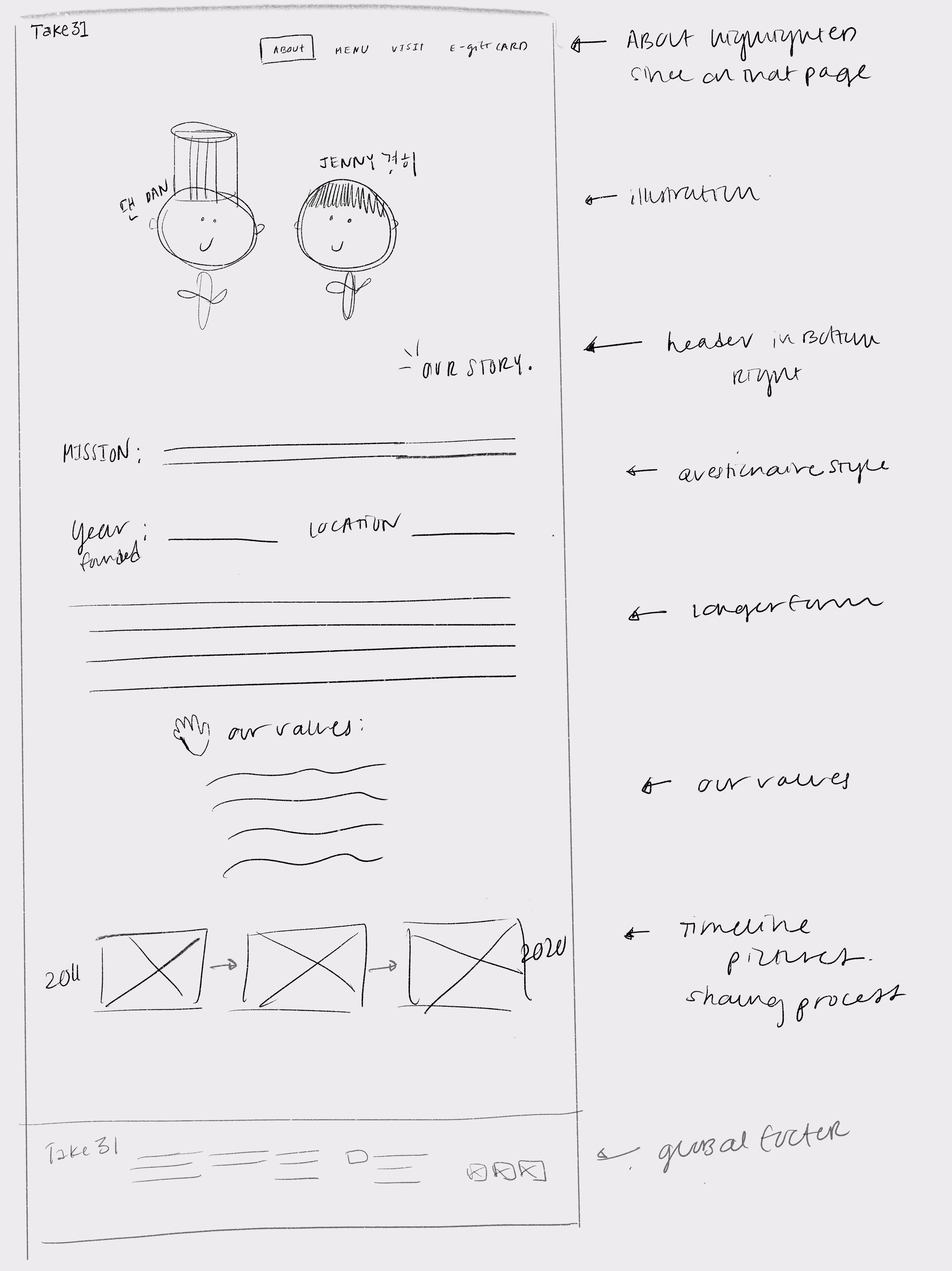
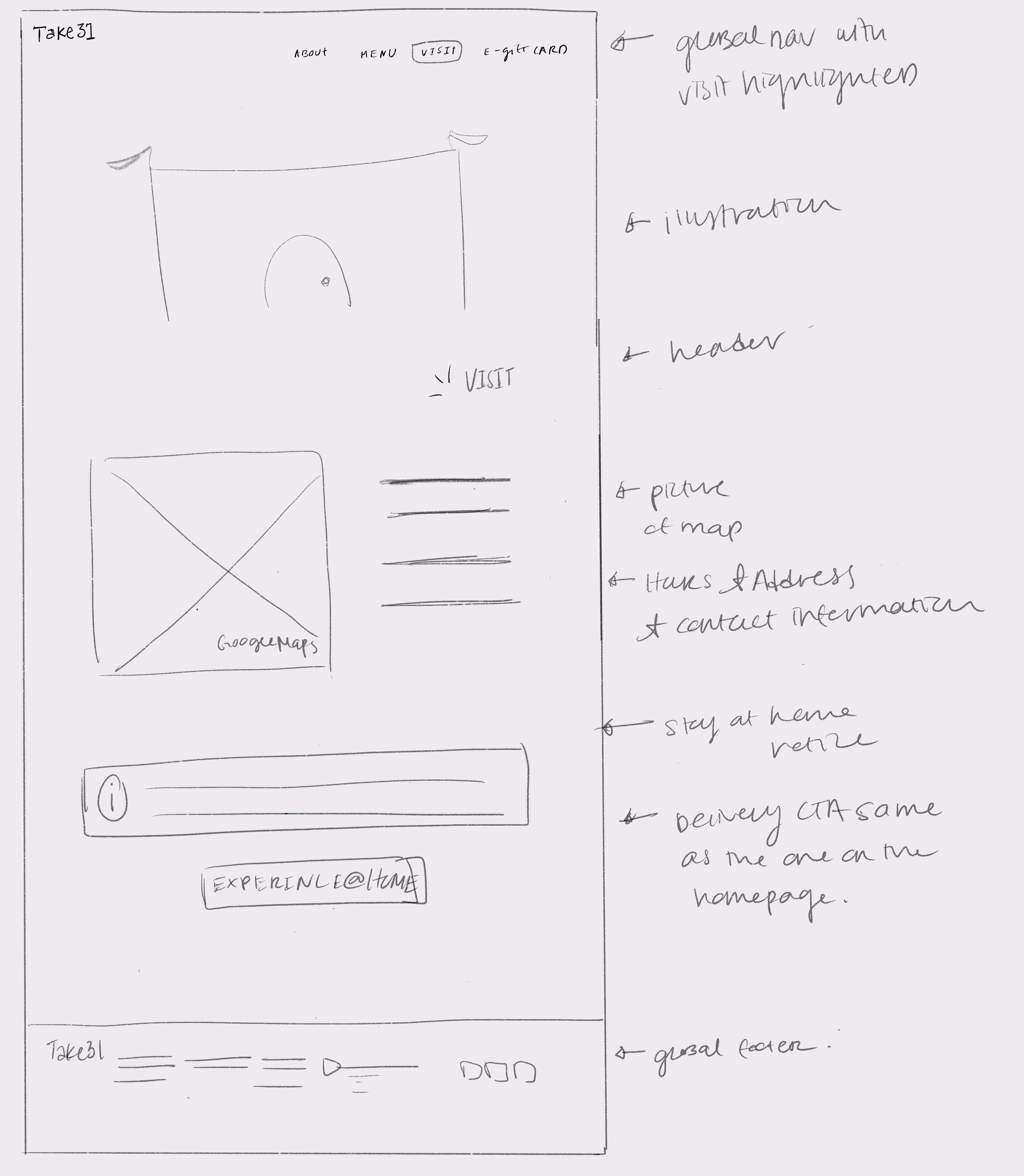
Low-Fidelity Wireframes
Assets: Sketches
Having explored how Sammy may move through the site, it was time to start sketching ideas to paper for the 10 pages I laid out in the sitemap.
Mid-Fidelity Wireframes
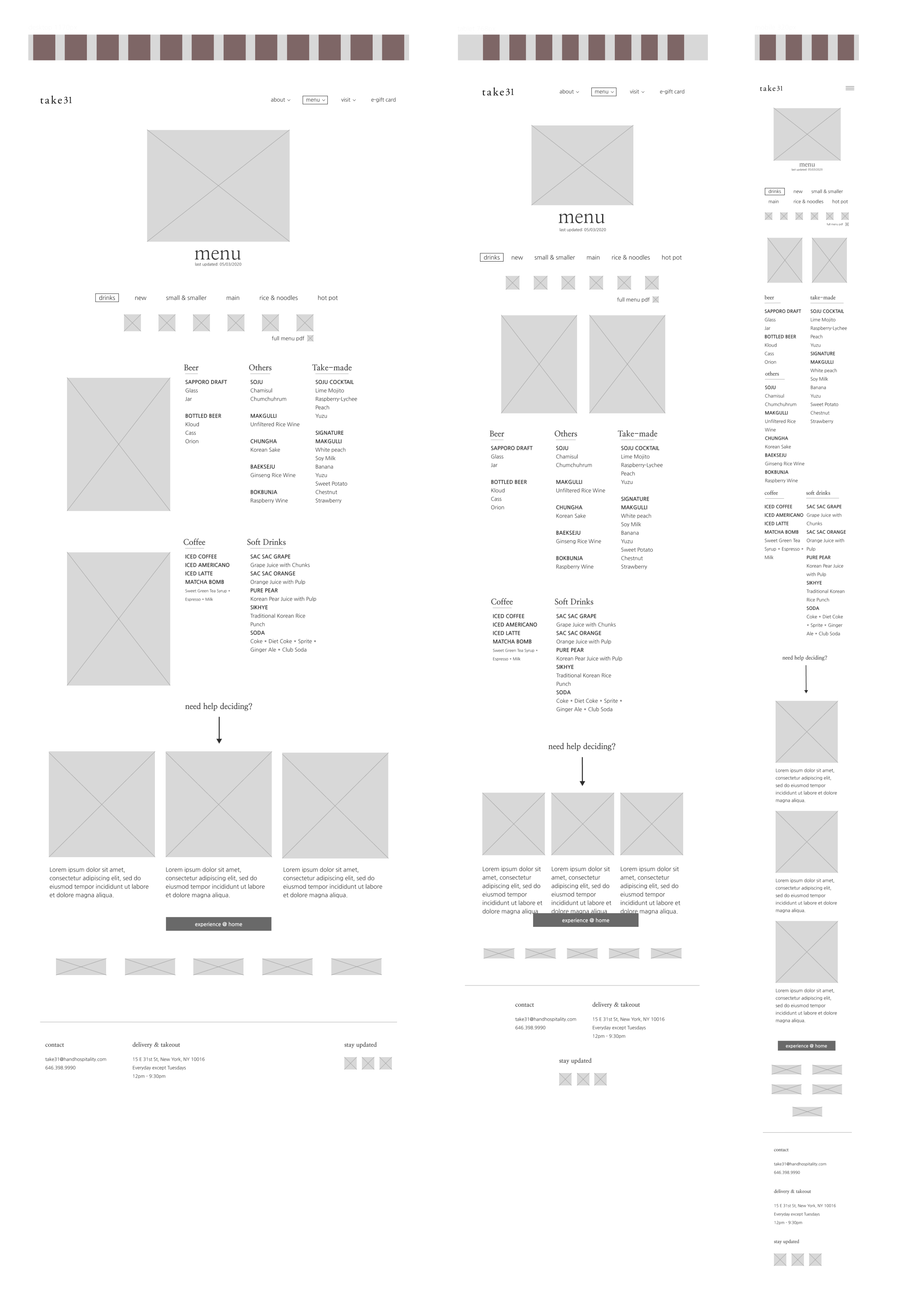
Assets: Responsive Wireframes, Desktop Wireframes
Having drawn out my low-fidelity wireframes, I had a good idea of what the site would look like and where the features I listed for pages in the UI requirement would land visually. With this, I created my mid-fidelity wireframes to have a more realistic foundation that I can build into a prototype for usability testing.
PROTOTYPE
Process: Logo & Style Tile, UI Kit, High-Fidelity Wireframes, Final Prototype
Prototype & Usability Test
Assets: Usability Test Plan, Prototype
Taking my complete mid-fidelity desktop wireframes I created a prototype in InVision to share with users who participated in my usability test. I chose to build a mid-fidelity prototype (vs. high-fidelity) so I can 1) Understand if users find the site easy to navigate and 2) To best prioritize my time through test & iteration (vs. fully building the final prototype and having to make massive edits).
With my prototype ready, I created a usability test plan outlining objectives:
- Understand if the site is easy to navigate
- Understand if users can easily locate information they need
- Identify any areas / UI on the site that may be confusing to users
I recruited 4-6 participants from the ages 20-35 years old who frequent restaurants (dine-in, take-out, delivery) at least 1x a week and gave them a series of scenarios and tasks to complete using the mid-fidelity prototype while thinking out loud. While they performed these tasks, I facilitated the session and observed their behavior while taking notes.
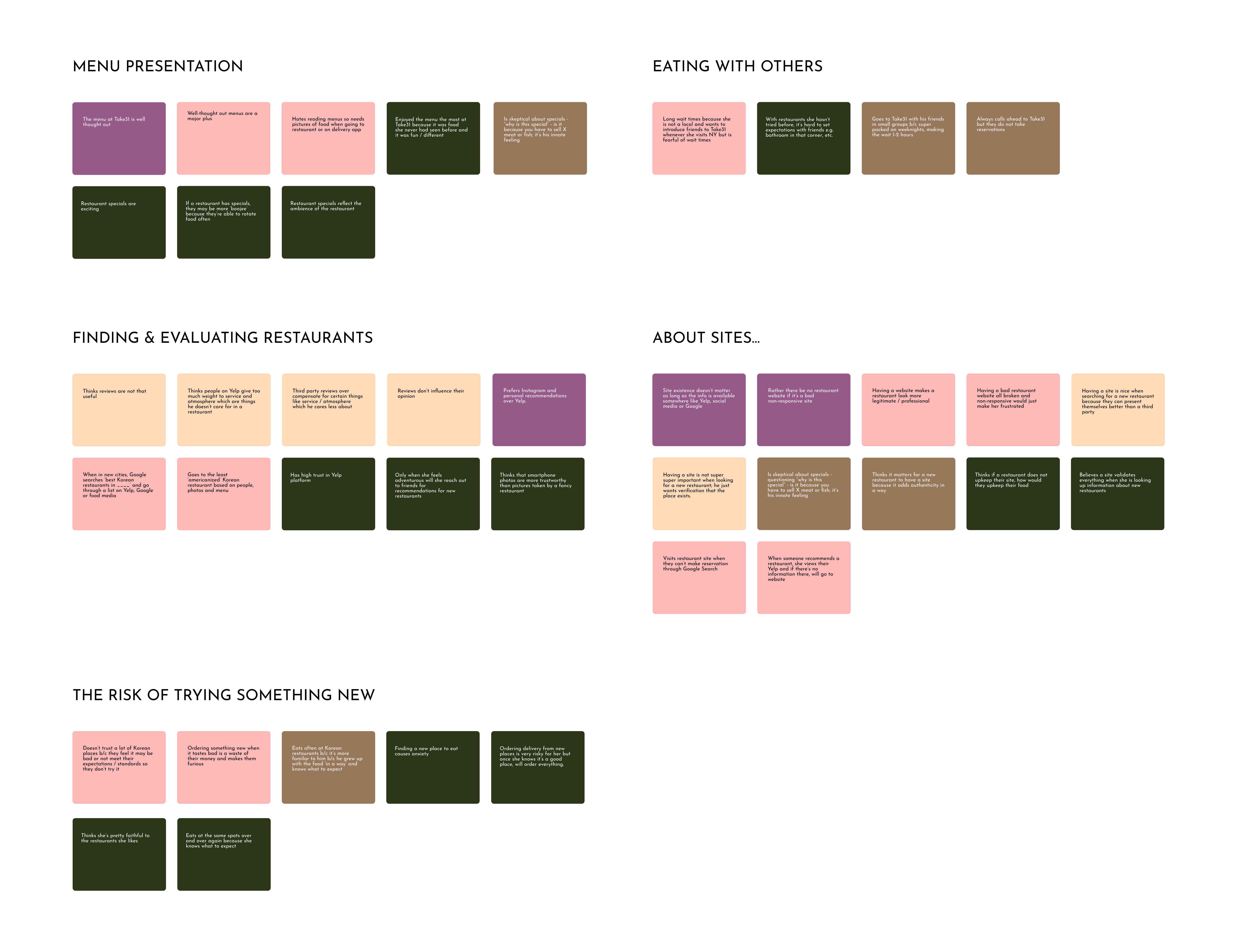
Revisions
Assets: Usability Test Findings, Affinity Map
From my notes and recordings of usability tests I conducted with users, I distilled each observation into a "sticky note" arranged by the individual tasks that participants were asked to complete. From this affinity map, I found key insights around providing users with a clearer more consistent navigation and making reservation / delivery information available in additional sections of the website.
USER INTERFACE DESIGN
Process: Logo & Style Tile, UI Kit, High-Fidelity Wireframes, Final Prototype
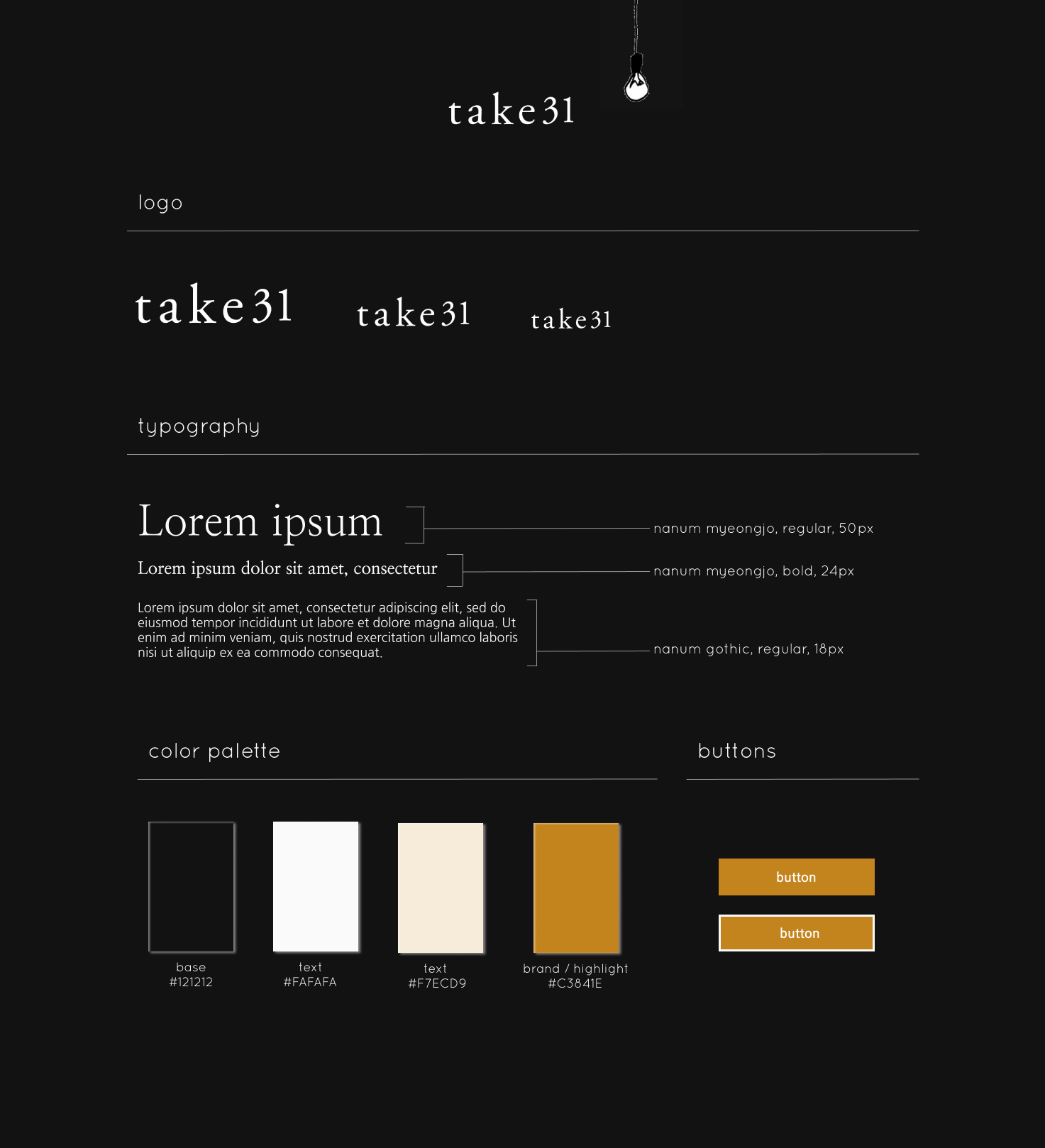
Logo & Style Tile
Assets: Brand Logo & Style Tile, UI Kit
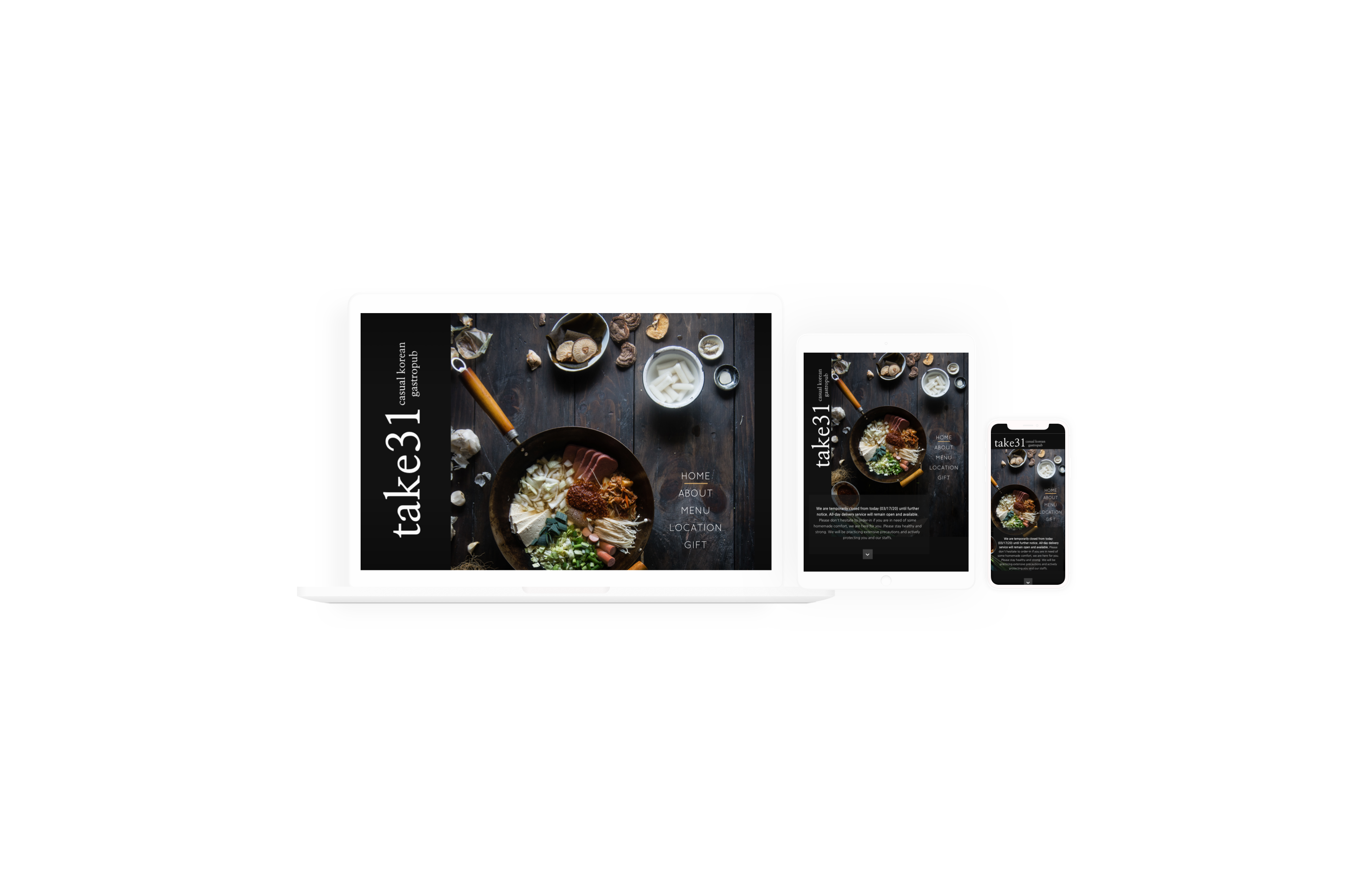
When it came to the UI design, I wanted to respect pre-existing take31 branding to deliver a consistent in-person take31 experience as well as digital experience. To do so, I utilized the existing logo, took inspiration from my in-person visits, and referenced user photos of the space. take31 describes themselves in a few ways, mainly as ‘rustic chic’, ‘Korean soul food’, ‘casual Korean gastropub’.
With this in mind, I centered the UI design around the following brand attributes: welcoming, casual, minimalistic, hip. To deliver on these adjectives, I included fun yet simplistic illustrations that subtly disrupted the black space, carefully selected photos, and a warm-tone brand / highlight color.
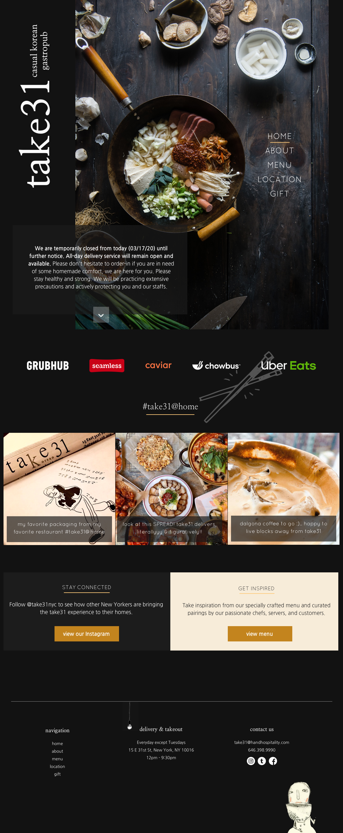
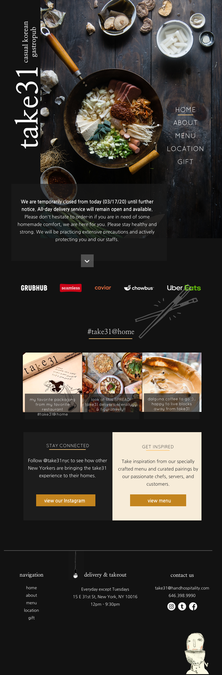
High-Fidelity Wireframes
Assets: High-Fidelity Wireframes, Prototype
Considering the usability test findings synthesized in the affinity map, priority revisions, and the user interface design, I created the high-fidelity desktop wireframes.

NEXT STEPS
Presentation & Hand-off
Moving forward, I would present my design to take31 stakeholders to ensure I met the original project brief and to confirm that the design helps to achieve their specified business goals. With their approval, I would design the tablet & mobile pages for the rest of the site (our story, menu, location, gift).
Reflection
My main learning from this project was that consistency doesn't have to be limiting, but rather can empower you to design creatively within bounds. If you review my original mid-fidelity wireframes and the final prototype, you'll notice there was a huge transformation (if I may say so myself!) from the two deliverables. This was me experimenting first, while keeping consistency as a consideration instead of allowing consistency to drive my design as priority. From the start of this project, I felt strongly that for a restaurant site, I need to nail the overall ease of experience for users but also really drive the brand forward with the design. I'm happy with the outcome and I think the project played out nicely for experimentation of layout, type, while delivering an easy-to-navigate responsive restaurant website.
Selected Works